SKILLS USED

ROLE
UX/UI Designer
TIMELINE
13 weeks (Sept. 2023 - Dec. 2023)
TEAM
Solo project
OVERVIEW
Agoracast is a podcast mobile app designed to simplify discovery, navigation, and content organization. The experience focuses on helping users easily explore, resume, and engage with meaningful content. Every decision was grounded in reducing friction and supporting real listening habits.
SOFTWARE


The Challenge
How might we design a podcast experience that feels intuitive, organized, and easy to return to?
THE PROBLEM
Podcast listeners often struggle to navigate content-heavy platforms and relocate meaningful episodes. This creates friction in both discovery and continued engagement.
• Users struggle to find episodes they previously started
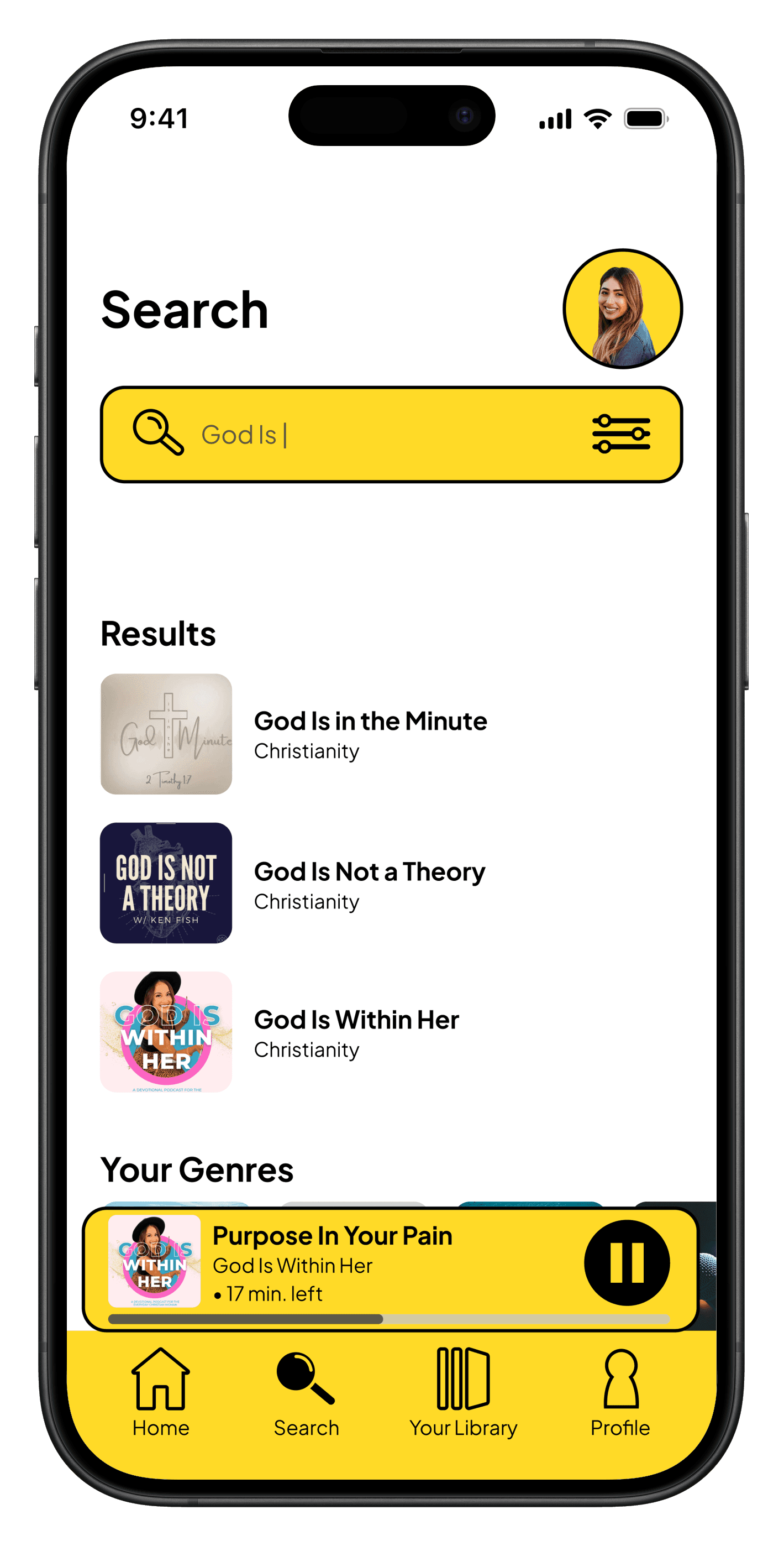
• Search functionality feels limited and inefficient
• Content lacks clear organization across genres
• Overly complex visuals distract from usability
Project Goals
Primary Goal
Create a clear and intuitive podcast experience
Business Goal
Increase user retention through improved usability
User Goal
Easily discover, organize, and resume meaningful content
Constraints and Consderations
Timeline: 13-week design process
Scope: 50+ screens total (wireframed, designed, & prototyped)
Podcast: Podcast-only platform
Technical: Fully-interactive prototype
Research
Design decisions informed by user insight.
I explored how users interact with podcast apps to identify gaps in clarity and usability.
RESEARCH METHODOLOGIES
User Interviews
Why this method:
1:1 interviews help to understand user's listening habits, frustrations, and needs
Participants:
3 people (2 university students, 1 middle-aged mother)
Duration:
15 min sessions per person
Key Findings:
Users struggle to find previously played episodes
Search feels limited and frustrating
Layout impacts overall enjoyment
I prepared a test and questions for my user interviews.
KEY INSIGHTS
Users need to easily pick up where they left off
Returning to content should feel effortless and immediate.
“Why is it so hard to find what I was just listening to?”
Search and structure shape the entire experience
If users can’t find content easily, they disengage quickly.
“I just want to find it without digging.”
Aesthetic clarity impacts usability
Clean design improves both usability and enjoyment.
“I like when it feels simple and easy to look at.”
"Something that makes a podcast app successful is the simplicity of the design layout.”
Anonymous
University Student
COMPETITOR ANALYSIS
Learning from what exists to create something better
I analyzed both direct competitors (expense tracking apps) and adjacent solutions (banking apps, accounting software) to identify market gaps and opportunities for differentiation.
Spotify
Pros
• personalized recommendations
• wide variety of content
Cons
• displays an overwhelming amount of categories and suggested content
Differentiation Opportunities
Ideation
Designing around real user behavior and journey stages.
I structured the experience to support users from discovery to long-term engagement.
1
2
3
4
Core design system: typography, color palette, and component library
KEY DESIGN DECISIONS
1
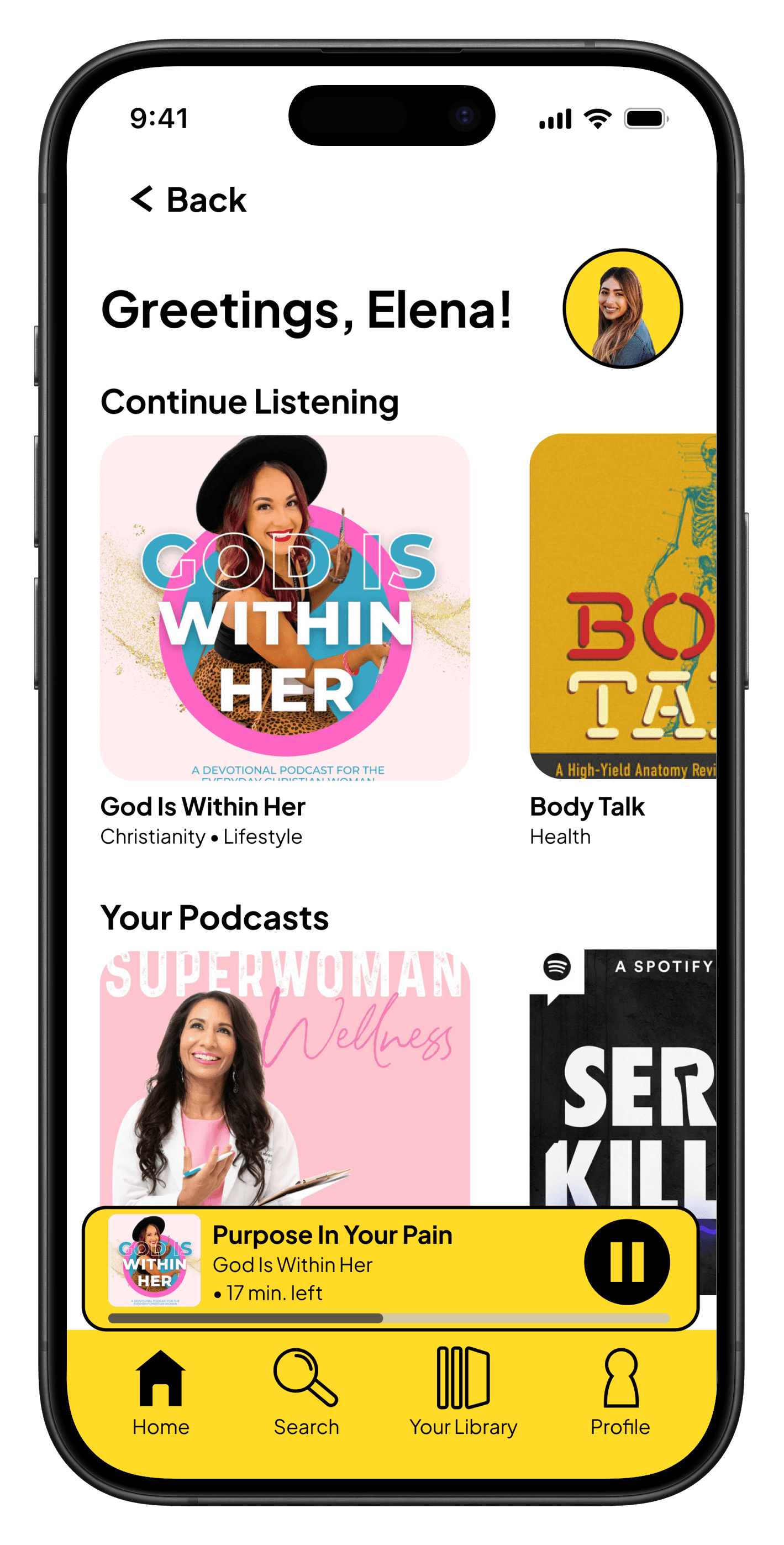
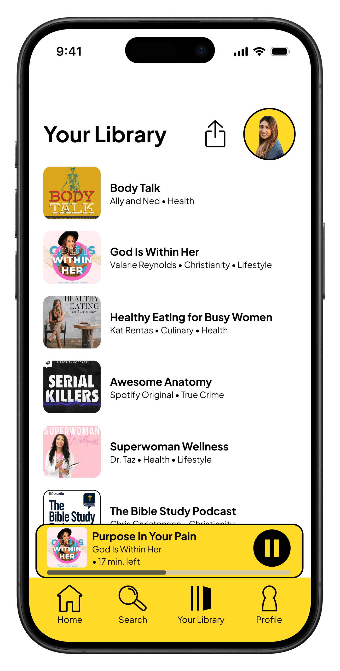
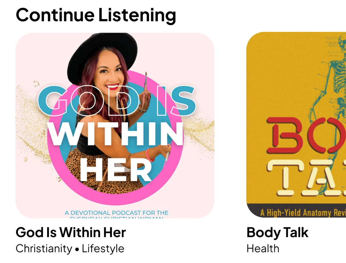
"Continue Listening" Feature
Why: Allows users to instantly return to unfinished content, directly addressing a key user frustration
Impact: Faster re-engagement and reduced friction
2
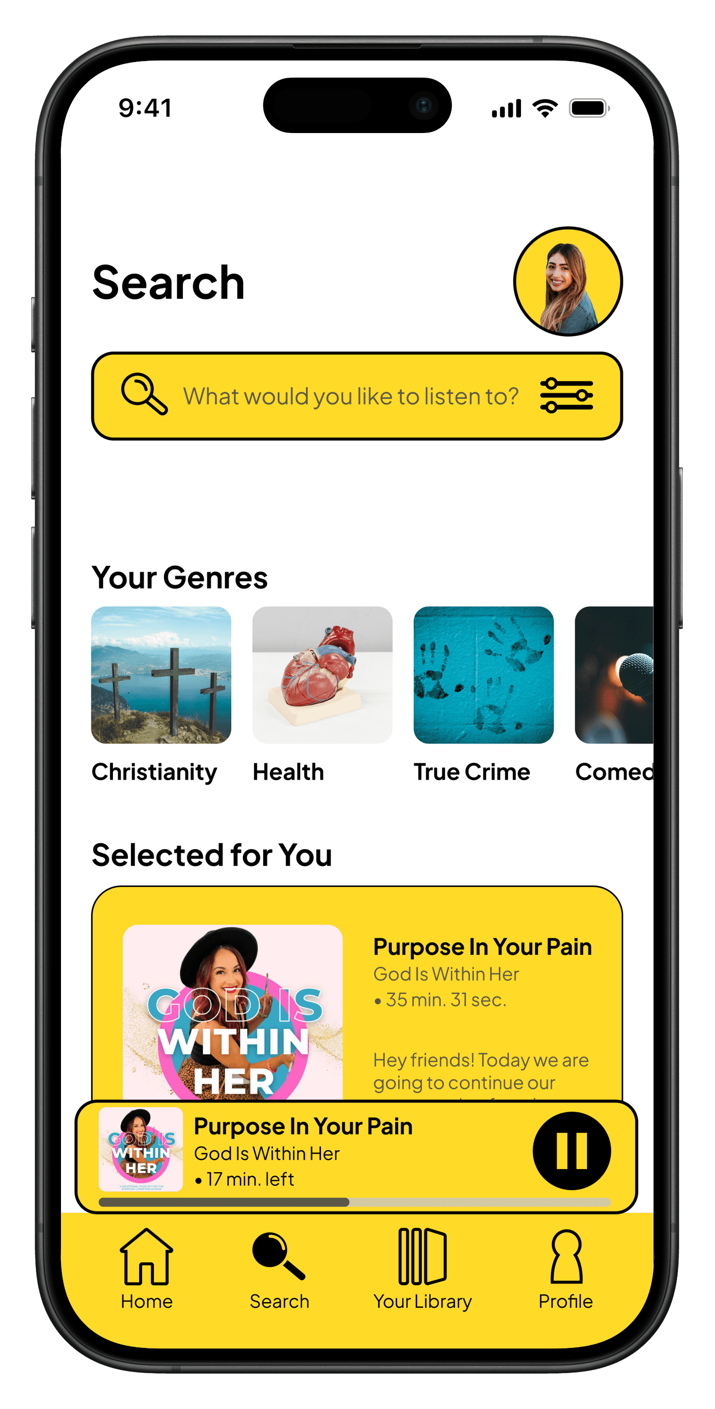
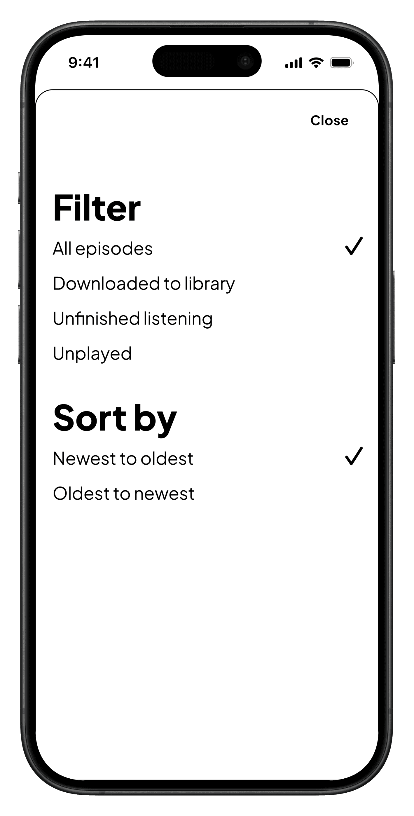
Improved Search Experience
3
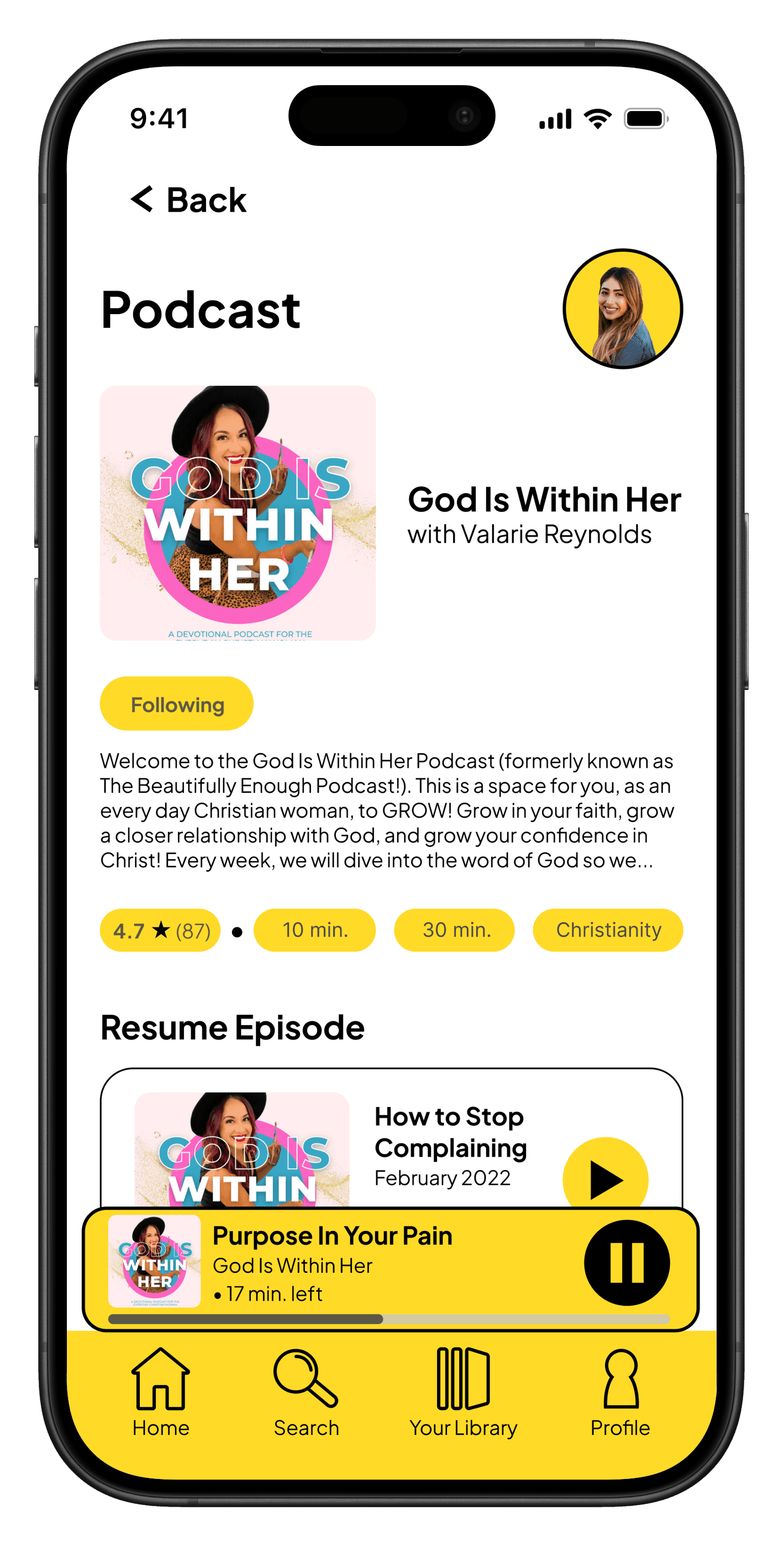
Genre-based Content Organization
Why: Clear categorization for educational, entertaining, and spiritual content, aligning with user goals and preferences
Impact: Easier browsing and content exploration
Design
Clean, focused, and intentionally minimal.
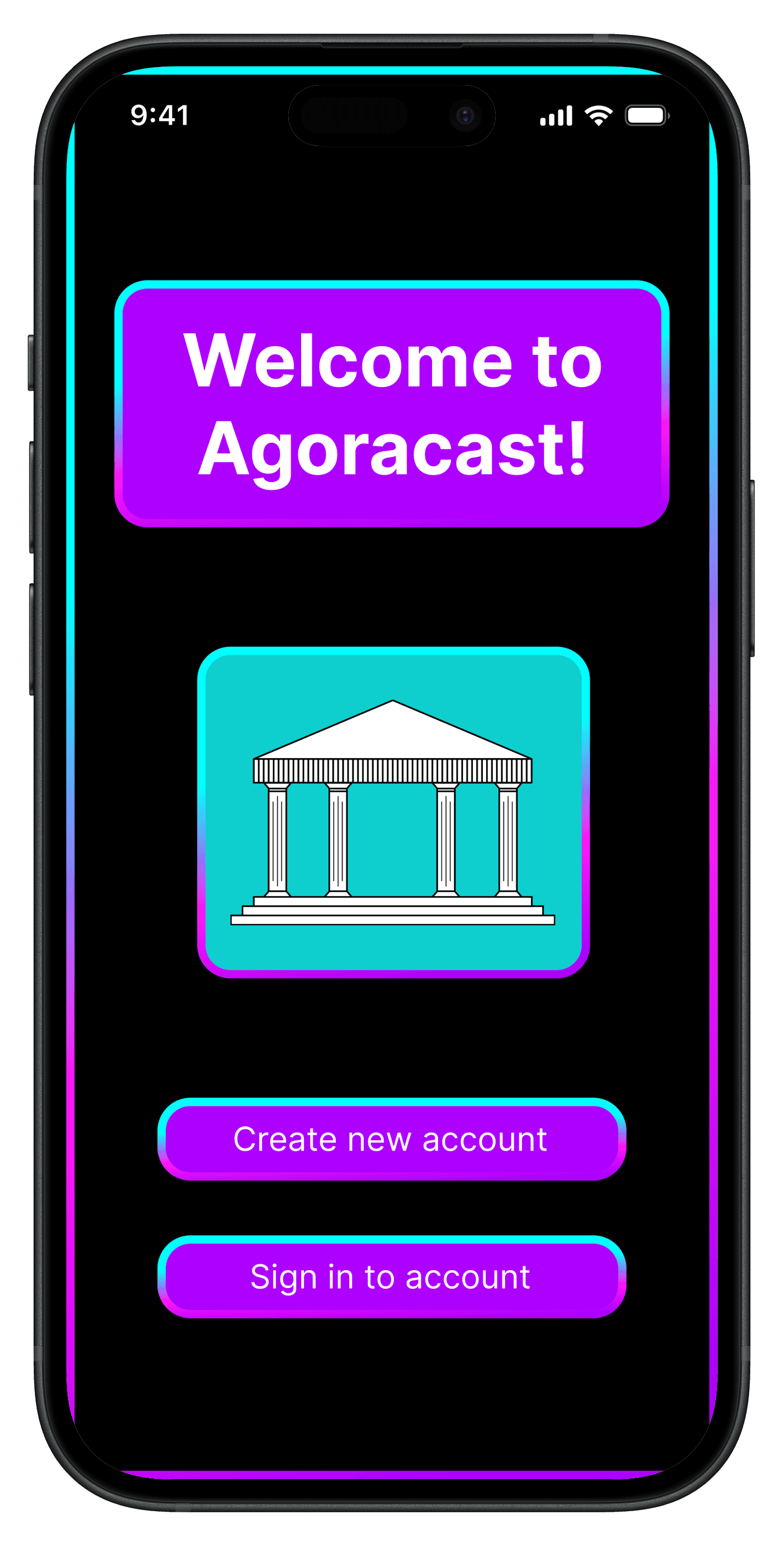
Agora is the ancient Greek word for “marketplace”. The Agoracast design supports usability while reinforcing the idea of a “marketplace of ideas.”
Color Palette
Yellow is used as a focused accent to symbolize ideas while black and white maintain a clean interface.

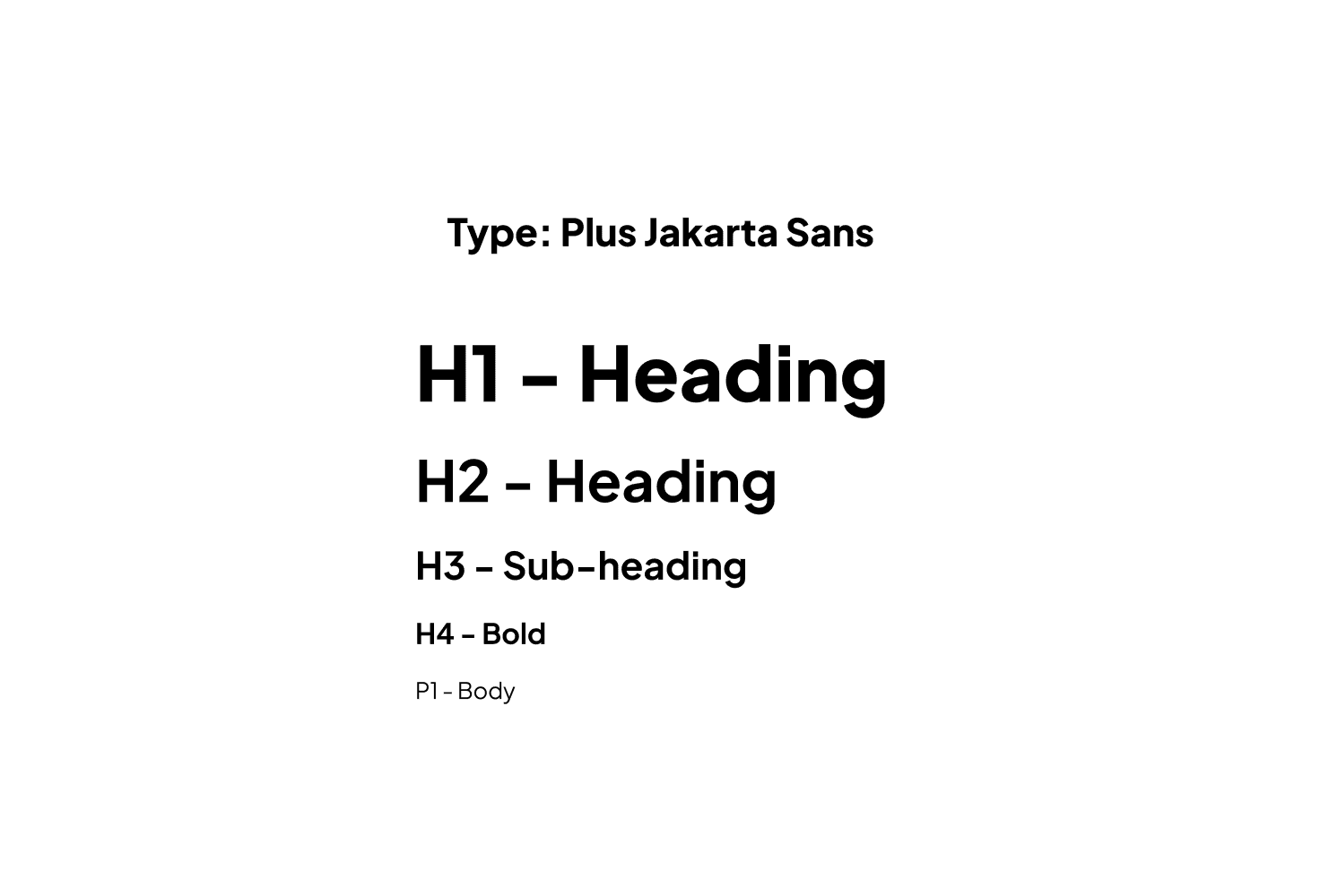
Typography
Plus Jakarta Sans supports readability and reinforces a modern, minimal aesthetic.
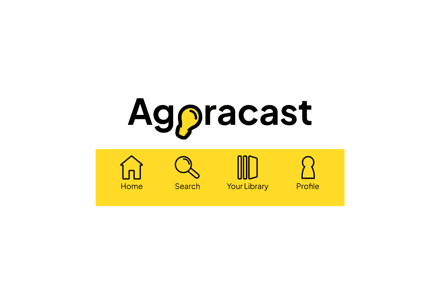
Logo & Graphics
The lightbulb logo represents the exchange of ideas inspired by the concept of the agora. Icons are handmade and add visual interest.
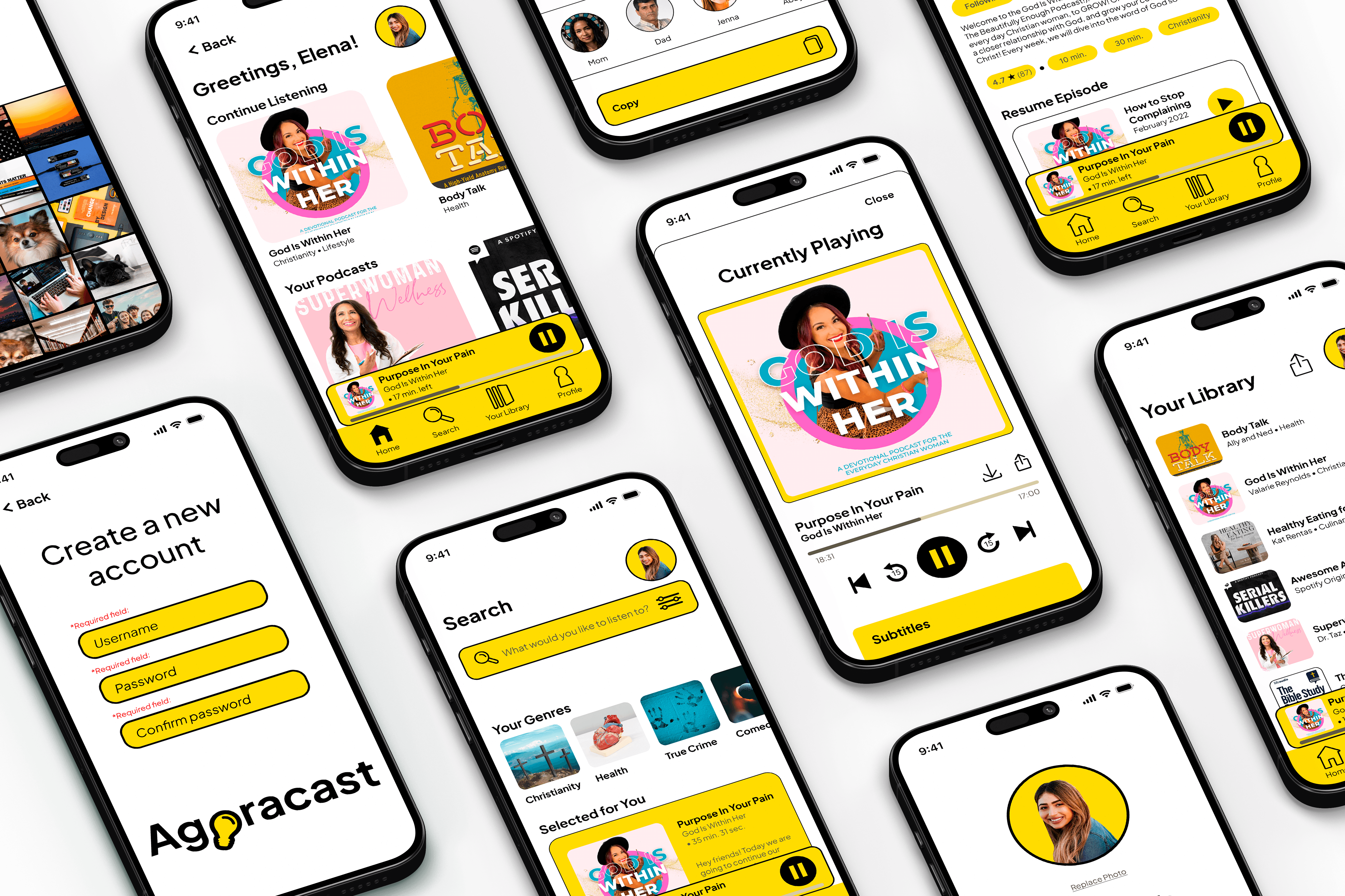
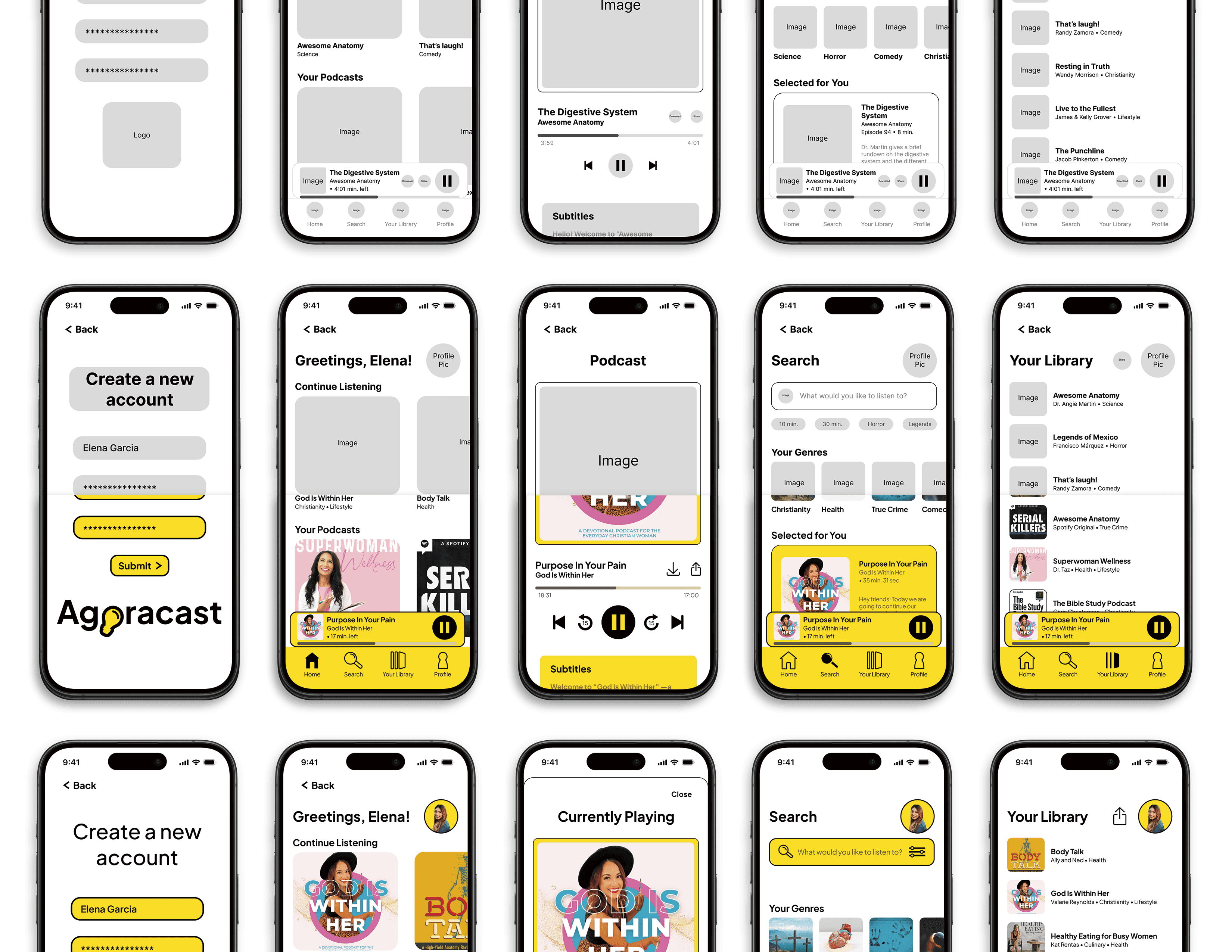
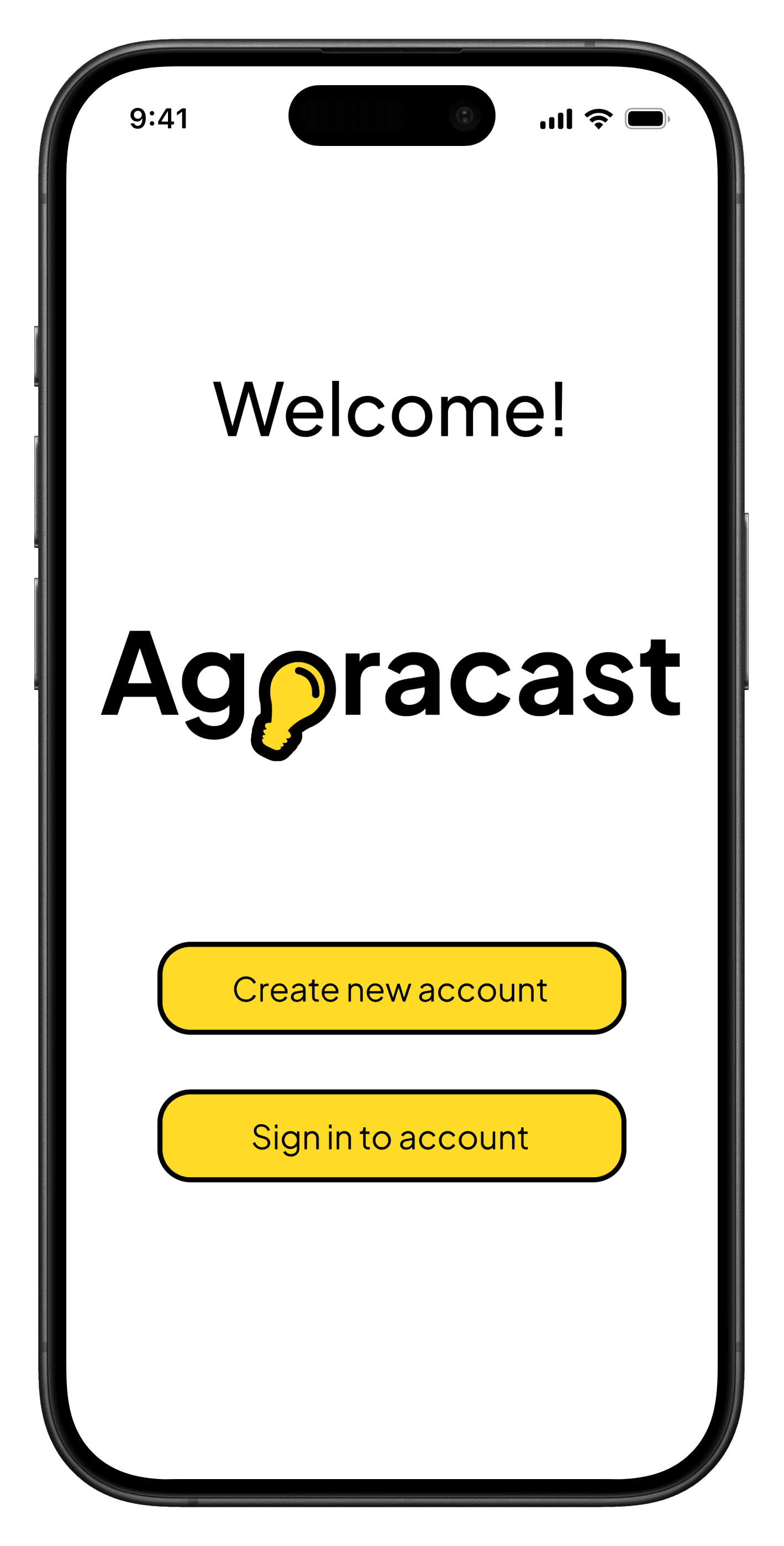
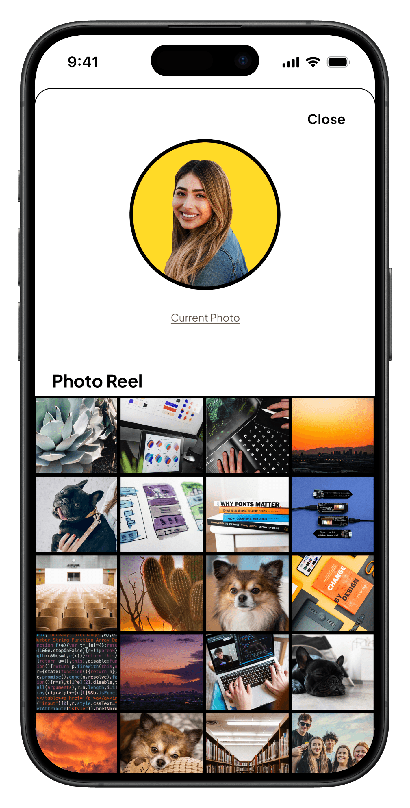
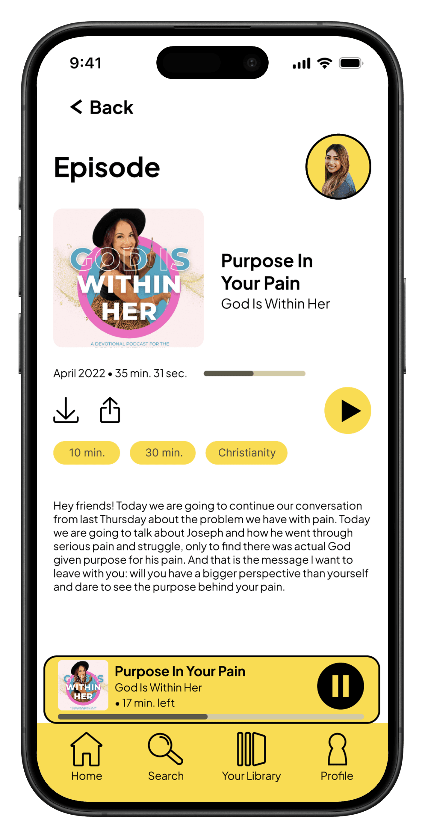
KEY SCREENS

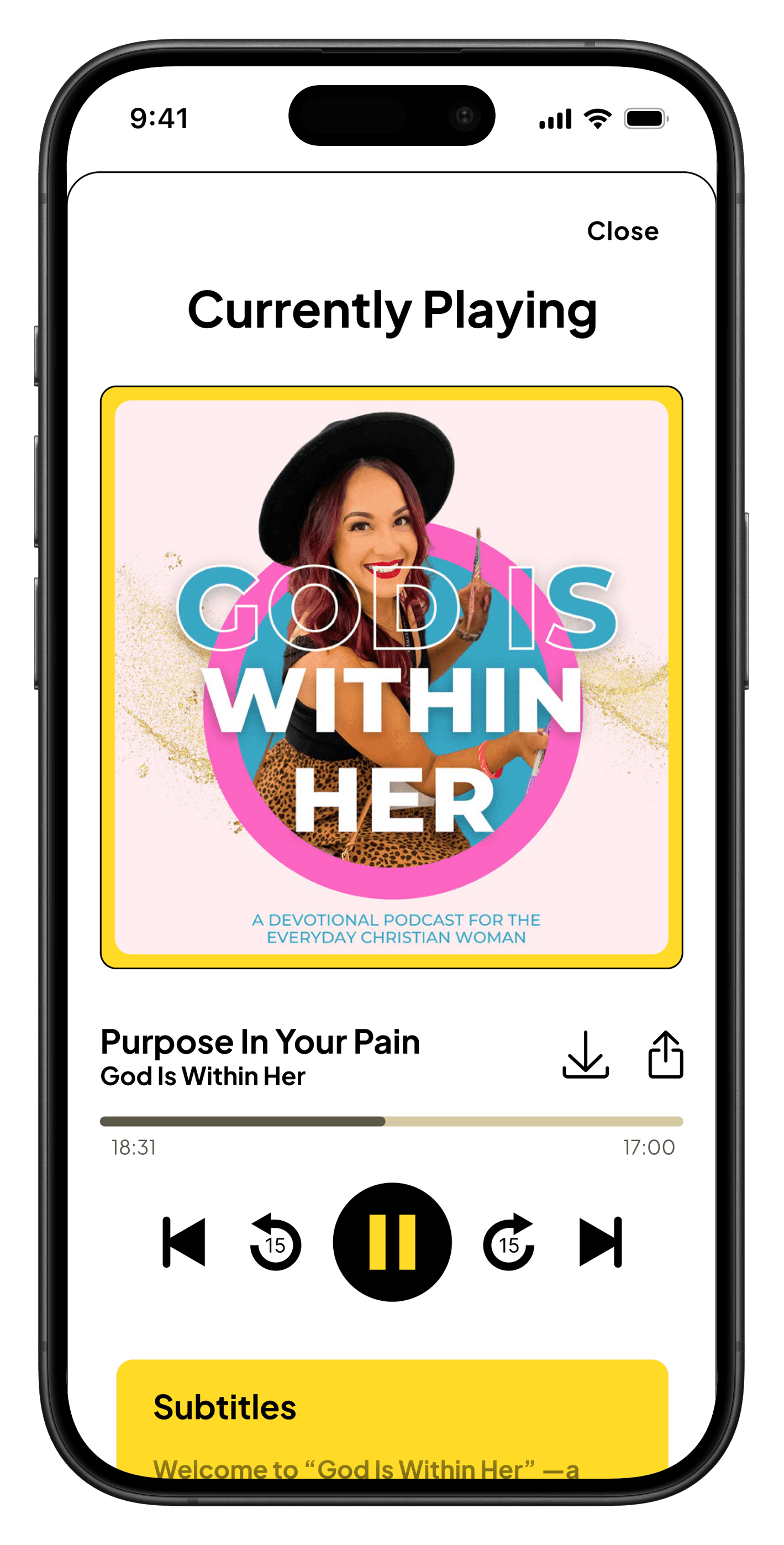
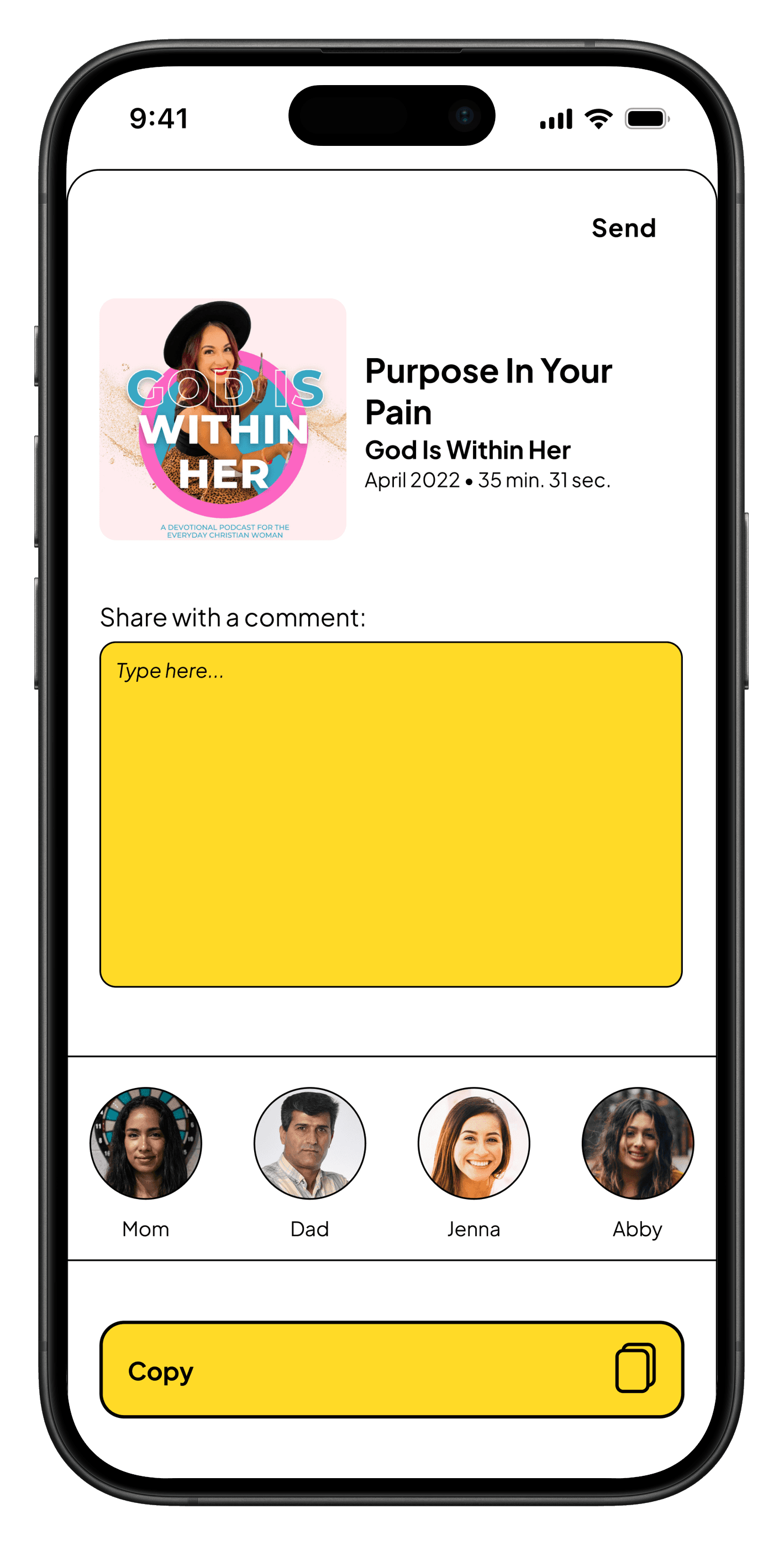
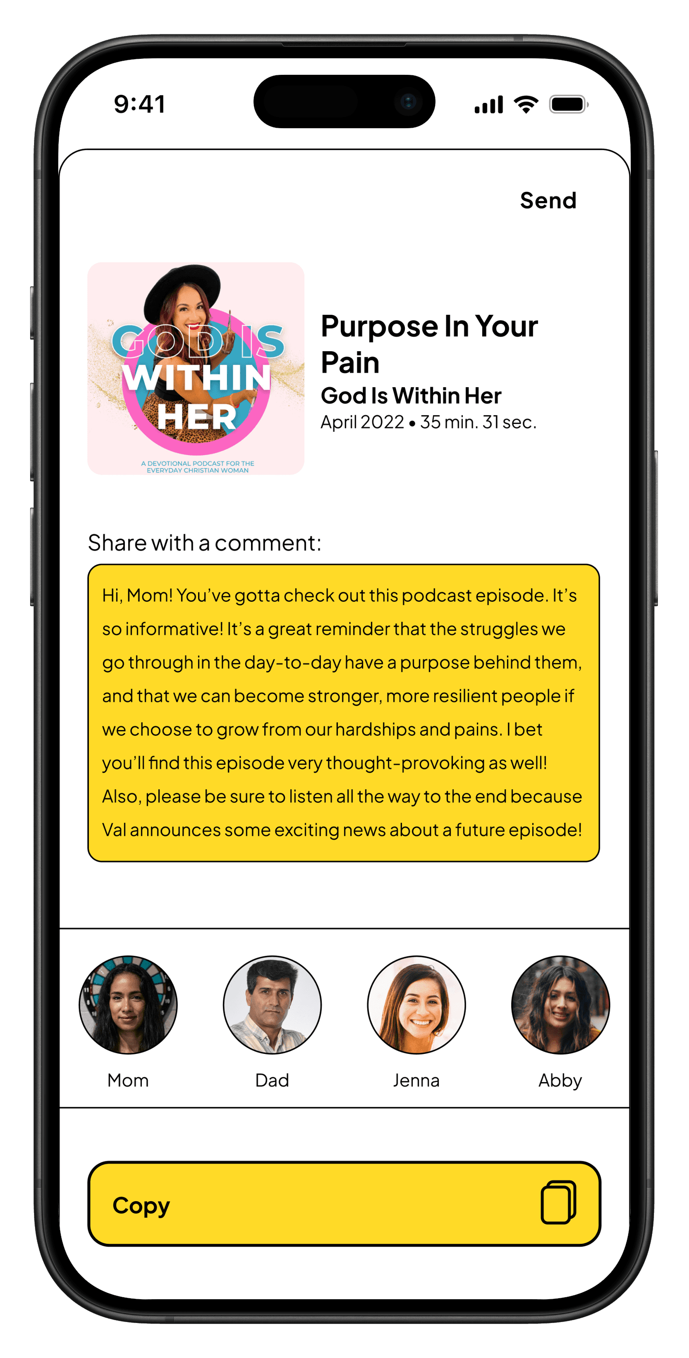
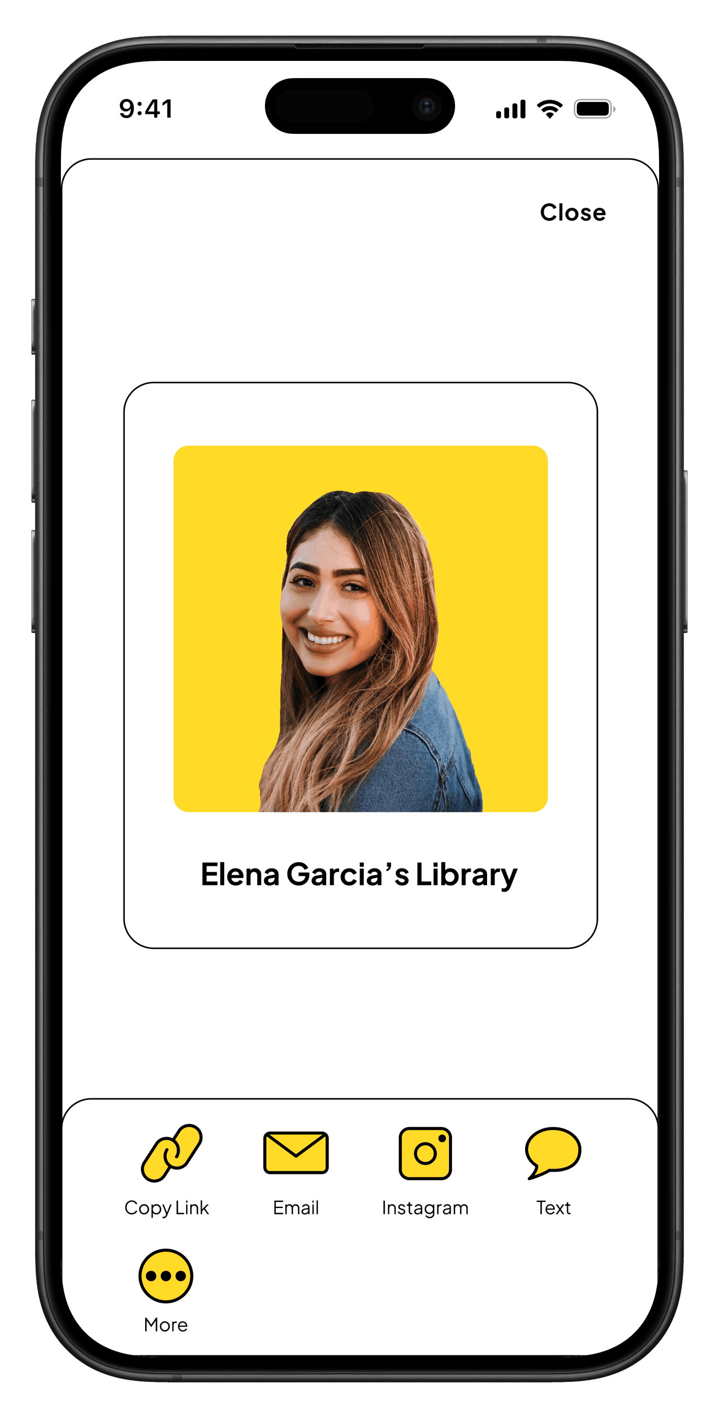
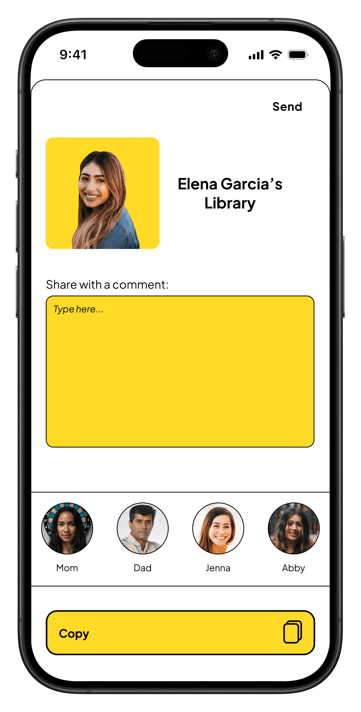


Micro-interactions & Delightful Additions
Clear “Continue Listening” section
Indicator of content that is presently playing
Subtle feedback that supports, not distracts
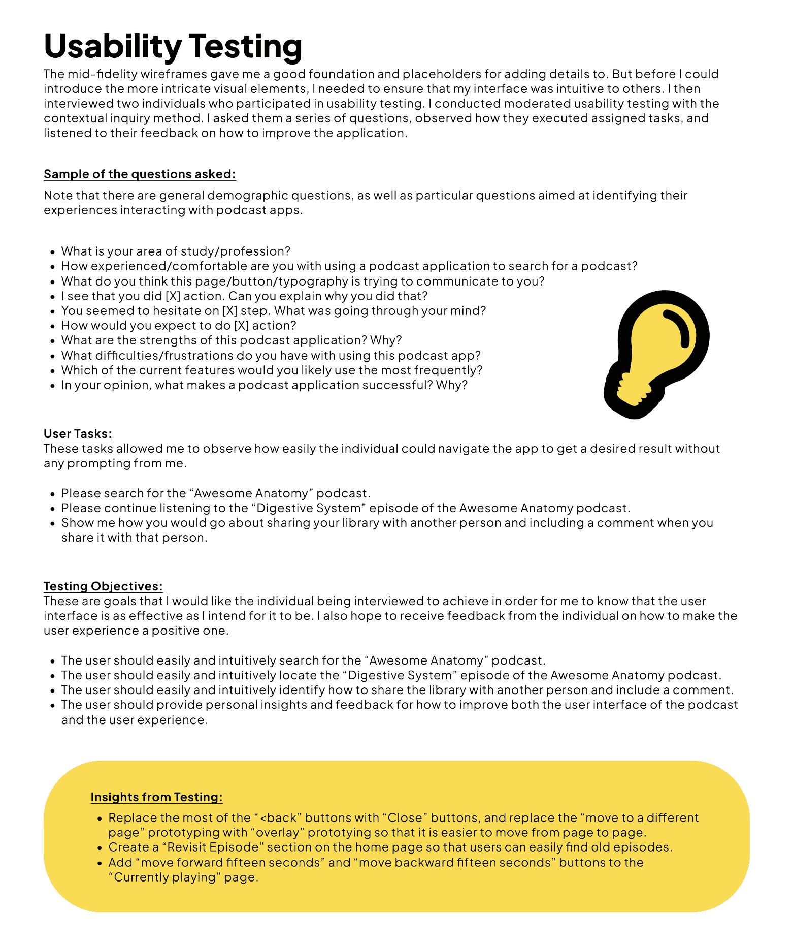
Testing & Iteration
Refining the experience through user feedback.
I tested how effectively users could navigate, search, and resume content.
TESTING METHODS
Round 1: Instructional Feedback
1 participant • Focus: improve brand identity
Round 2: Usability Heuristics Evaluation
self-evaluation • Focus: should add pop-up messages and "required field" labels
ITERATION EXAMPLES
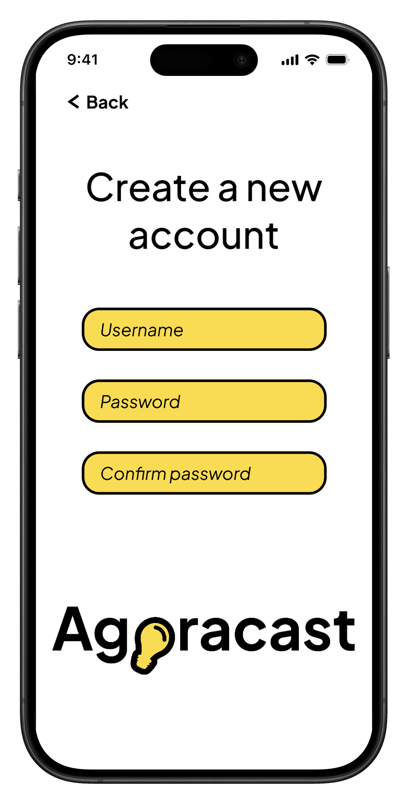
Before
Login Screen - First Iteration
After
Login Screen - Fifth Iteration (based on Round 1 feedback)
Before
I did not provide users with clarification for if they downloaded content.
After
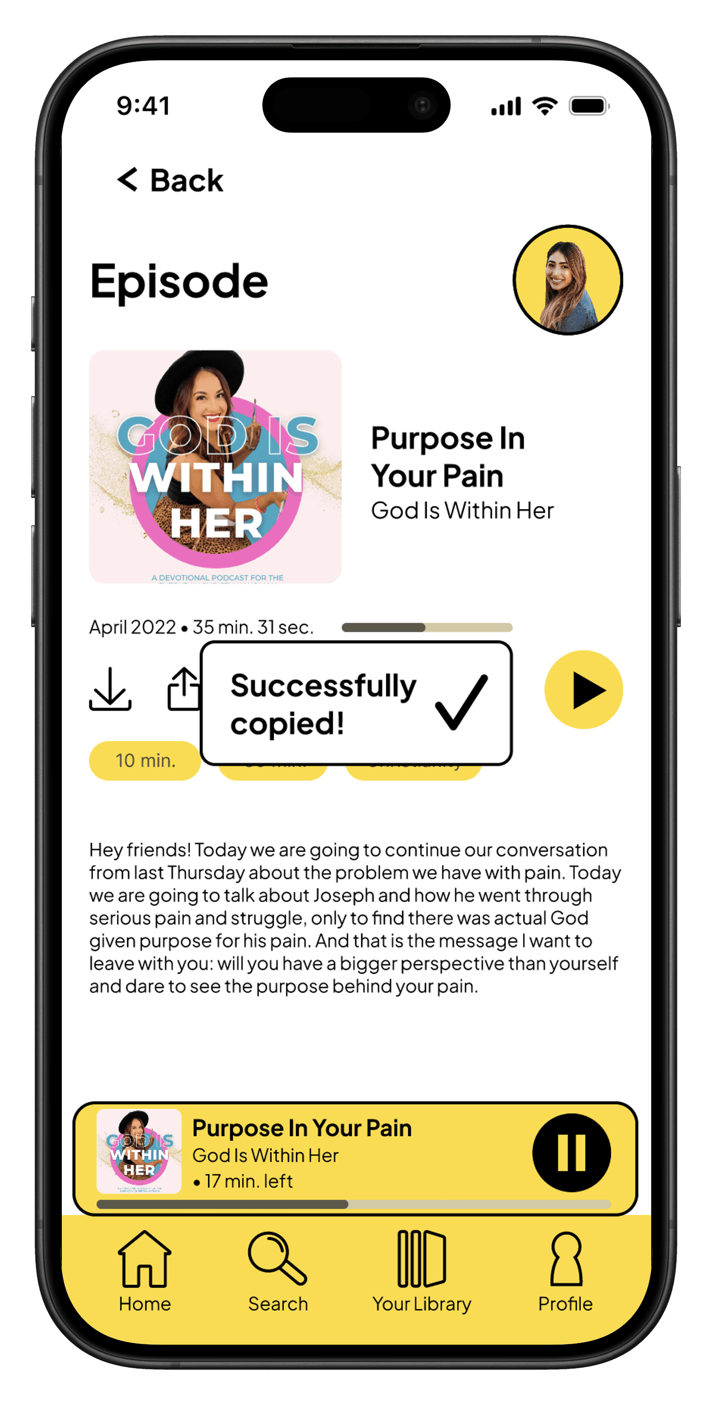
Users receive a "successfully downloaded" confirmation pop-up.
Before
I did not give users the option to cancel logging out if it was a mistake.
After
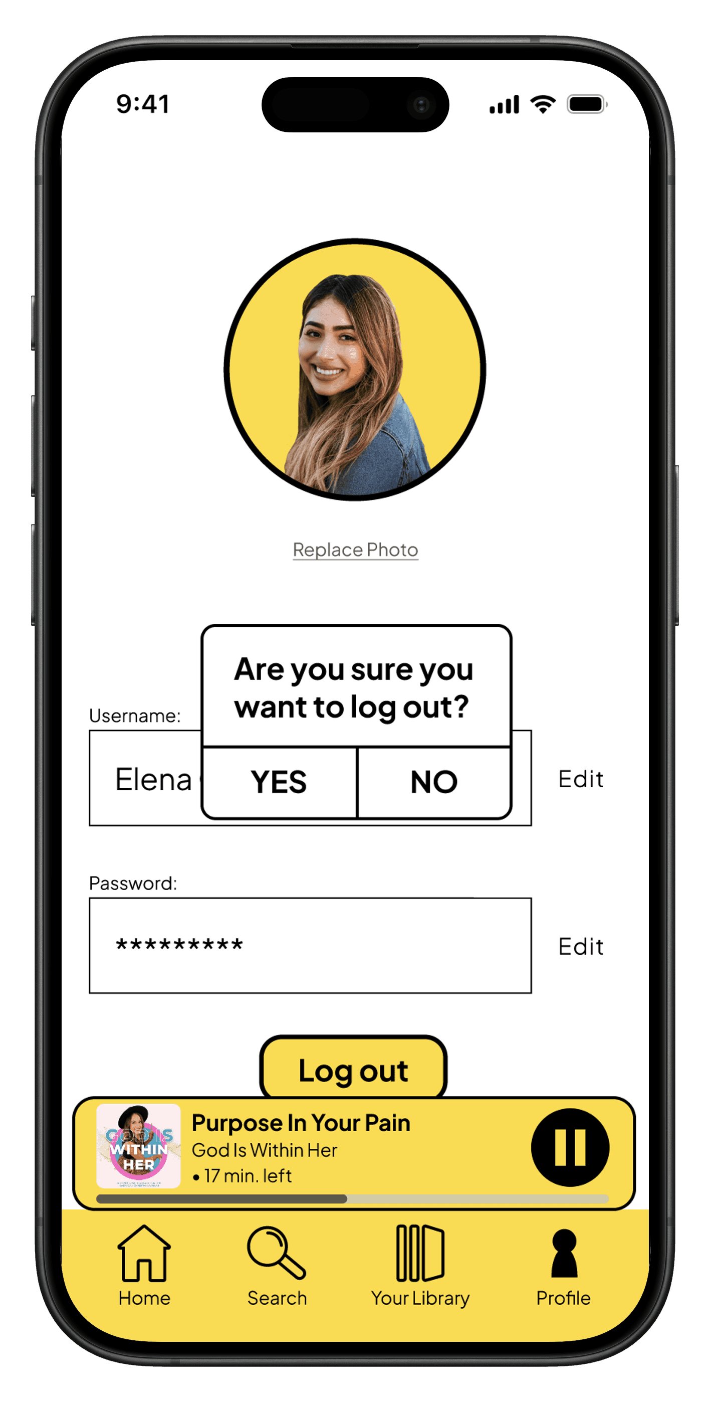
Users receive a warning pop-up in case they don't want to log out.
Before
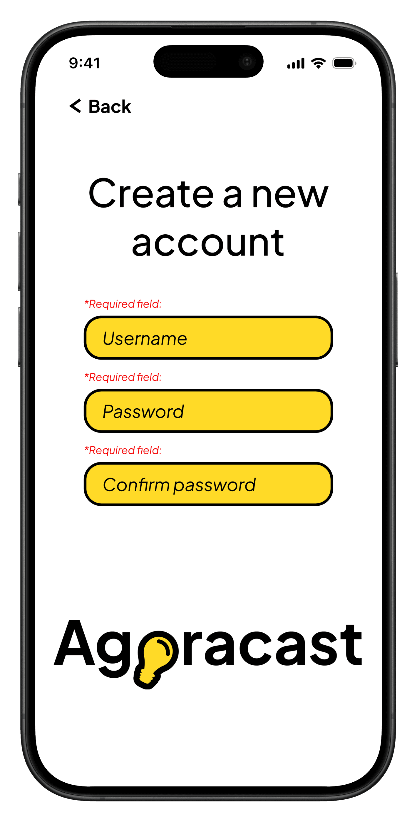
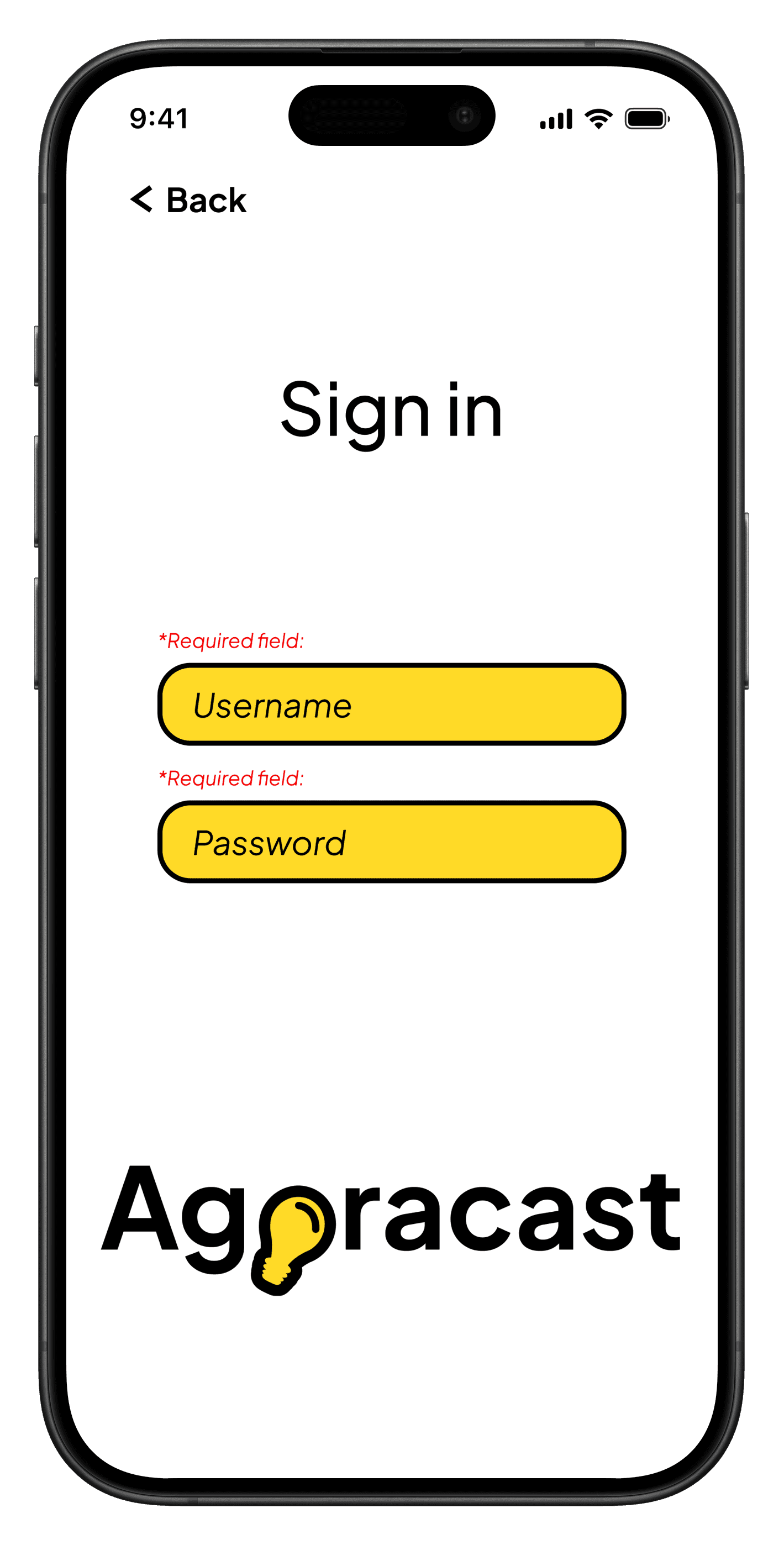
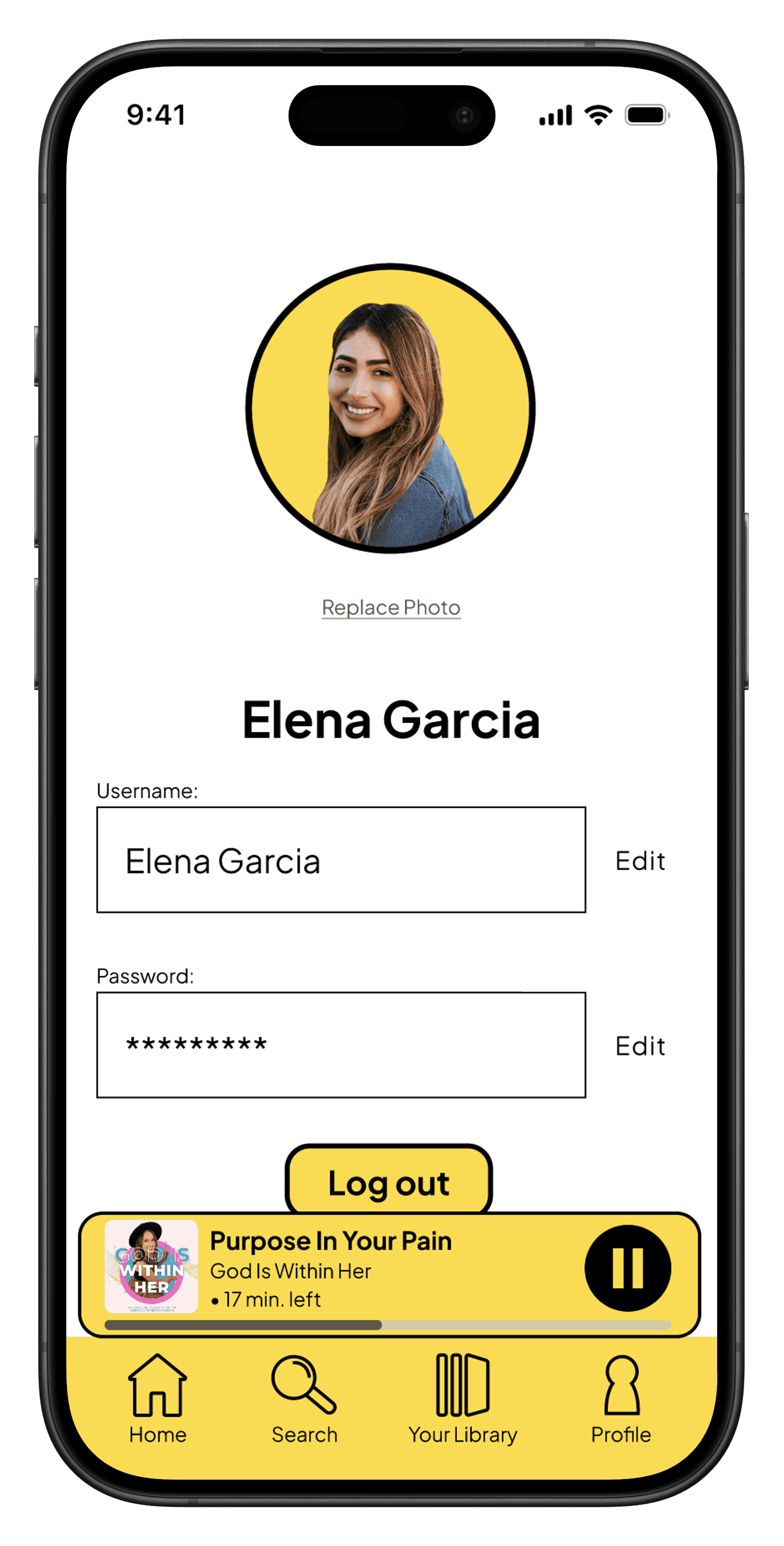
I did not clearly state which fields were mandatory or optional to fill out.
After
Users see "*Required field" text above mandatory fields.
Reflection
What this project taught me about design and myself
I conducted mixed-method research to understand not just what users do, but why they do it. The goal was to uncover the emotional and practical barriers to effective expense management.
Lessons Learned
1
Clarity defines success.
A design is successful when users can navigate and understand it intuitively, without needing explanation.
2
Simplicity requires intention.
Stripping back visual elements improves usability, but only when enough structure remains to guide the user.
3
Strong process leads to stronger outcomes.
Staying organized, iterating consistently, and refining decisions over time results in more thoughtful and effective design.
WHAT WORKED WELL
User-centered feature prioritization
Designing around real pain points improved usability and relevance.
Clear content structure
Organized layouts reduced overwhelm and improved navigation.
Balanced visual design
Clean aesthetics supported usability without feeling empty.
WHAT I'D DO DIFFERENTLY
Add more micro-interactions
Introducing more subtle, thoughtful interactions can enhance feedback, engagement, and delight without adding complexity.
Testing across more user types
Include a wider range of listening habits and preferences.
Refine personalization features
Introduce more tailored content recommendations.
Areas to Explore
If I had more time and resources, I would explore:
Adapting the design for desktop
Would create a more flexible, cross-platform experience and support a wider range of user contexts
Advanced personalization
More relevant content recommendations
Social sharing features
Encourage more connection and sharing podcast content between users, potentially with gamification
Let's work together!
Interested in collaborating or learning more about my process? I'd love to hear from you.