SKILLS USED

ROLE
TIMELINE
16 weeks (Sept. 2025 - Dec. 2025)
TEAM
Solo project
OVERVIEW
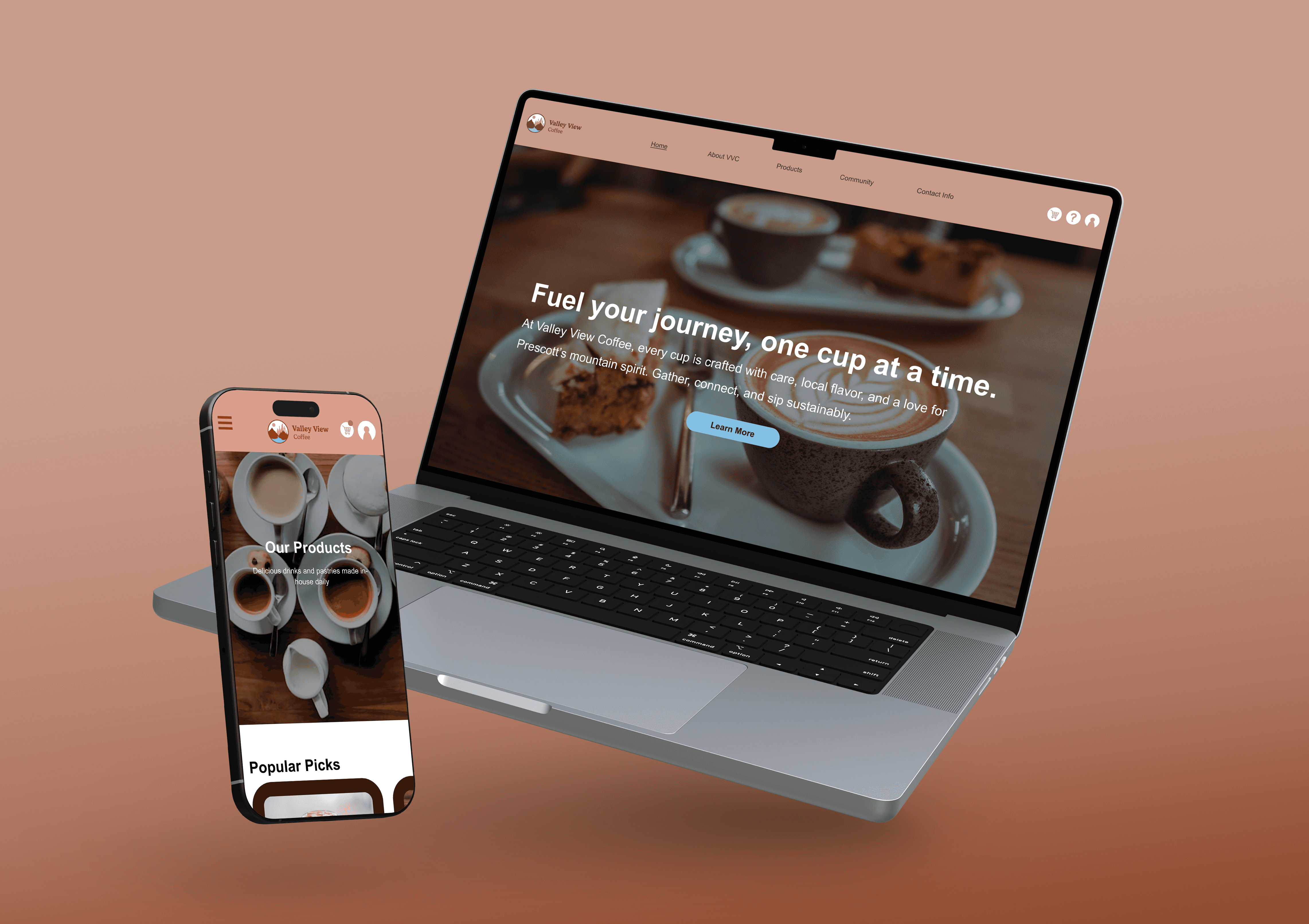
Valley View Coffee is a brand and responsive website designed for a Prescott, Arizona coffee shop rooted in community, sustainability, and craftsmanship. The goal was to translate a rich brand identity into a digital experience that feels just as welcoming as the physical space.
SOFTWARE


The Challenge
How might we translate a warm, community-driven coffee brand into a clear and engaging digital experience?
THE PROBLEM
Local coffee brands often have strong in-person experiences, but their digital presence feels disconnected or generic. This creates a gap between first impression and real-world experience.
• Coffee shop websites often lack a clear structure and hierarchy
• Brand personality is not consistently carried into digital spaces
• Users struggle to quickly find information (menu, location, events)
• Community-driven aspects are often underrepresented
Project Goals
Primary Goal
Create a cohesive digital experience that reflects the brand’s warmth and identity
Business Goal
Increase visibility, engagement, and future e-commerce potential
User Goal
Easily explore offerings, connect with the brand, and feel welcomed

Constraints and Consderations
Timeline: 16 weeks
Security: E-commerce screens considered in Figma but not fully developed in Webflow
Technical: Main site pages designed in Figma and built responsively in Webflow
Research
Understanding how users interact with local coffee shop websites.
I analyzed user expectations and common patterns to identify what makes a coffee website feel intuitive and inviting.
RESEARCH METHODOLOGIES
Heuristic Review
Why this method:
To identify usability issues
Key Findings:
Key information is often buried
Mobile responsiveness is inconsistent
Visual hierarchy lacks clarity
Competitive Analysis
Why this method:
Identify strengths and gaps in existing experiences of local coffee websites
Key Findings:
Black and white color scheme is common
Using a mug in the logo is overused
Community engagement is underutilized
KEY INSIGHTS
Users scan before they engage
Clear structure is essential for first impressions.
“I just want to know where things are on the site right away.”
Brand feeling matters as much as function
Users expect the website to reflect the physical experience.
“It should feel like the place, not just show the place.”
Community builds connection
Highlighting events and local impact strengthens engagement.
“I’d come here if I felt part of something.”
“If the website feels inviting, I’m more likely to visit.”
COMPETITOR ANALYSIS
Most coffee websites inform—but don’t highlight connections.
I analyzed competitors to identify market gaps and opportunities for differentiation.
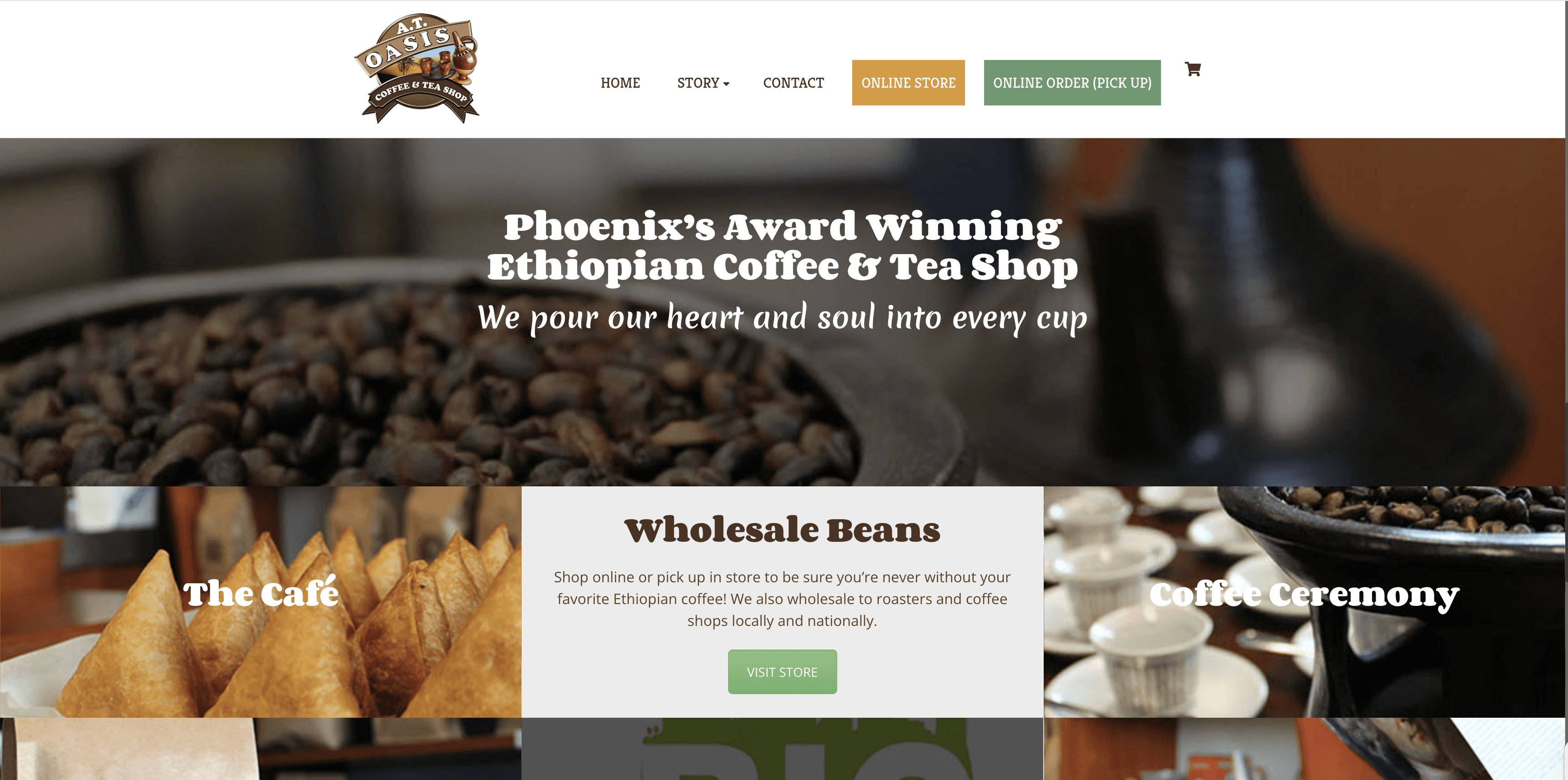
A.T. Oasis Coffee and Tea
Pros
• appealing micro-interactions
• structured layout
Cons
• Excessive typefaces hinder brand clarity
• Community page is not easily accessible
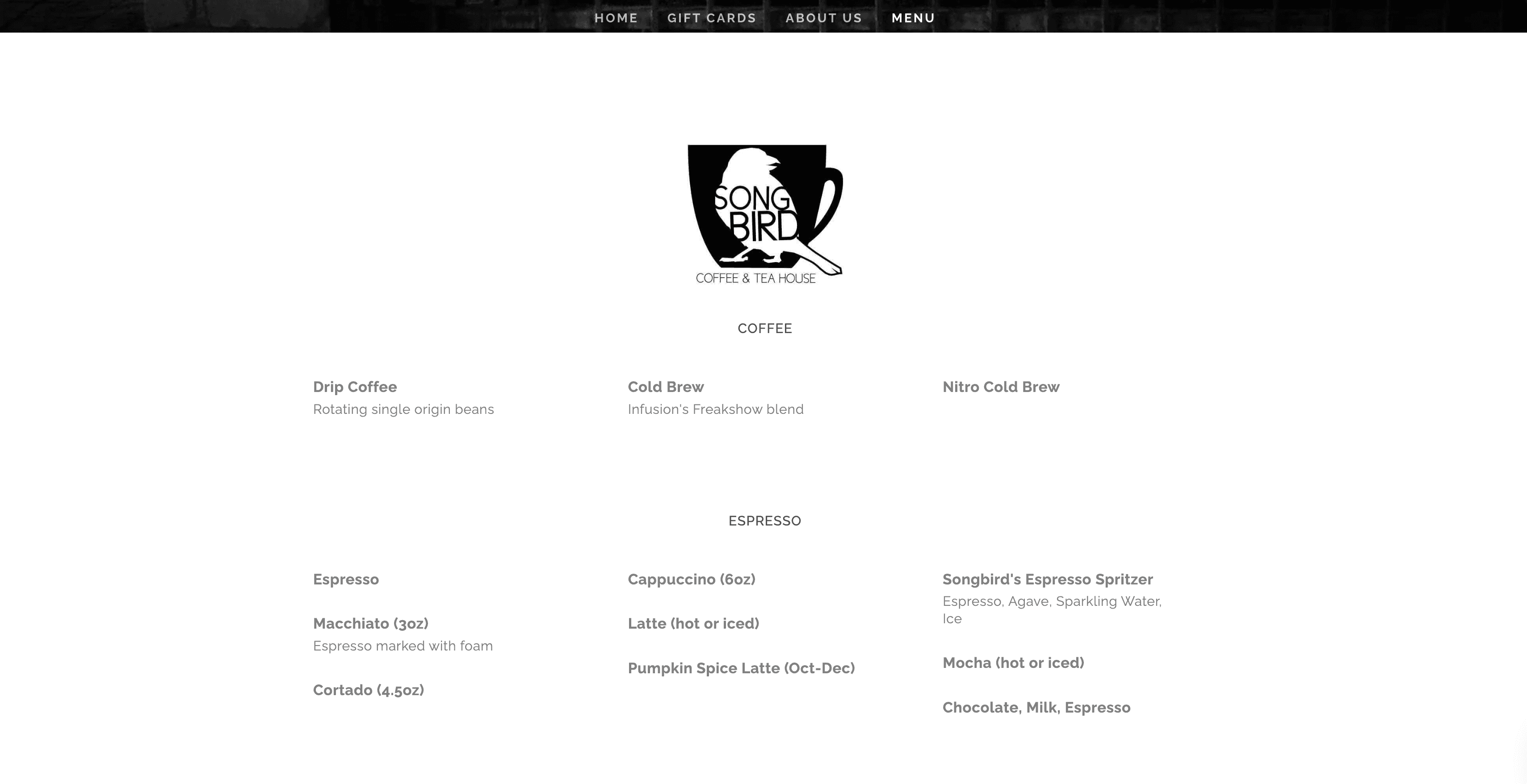
Songbird Coffee and Tea House
Pros
• Clean, minimalist brand
• Responsive site
Cons
• Lack of product images
• Not highlighting performance nights
Differentiation Opportunities
Ideation
Bringing brand identity into a digital space.
I focused on how to translate physical warmth and community into a structured, intuitive interface.
1
2
3
4
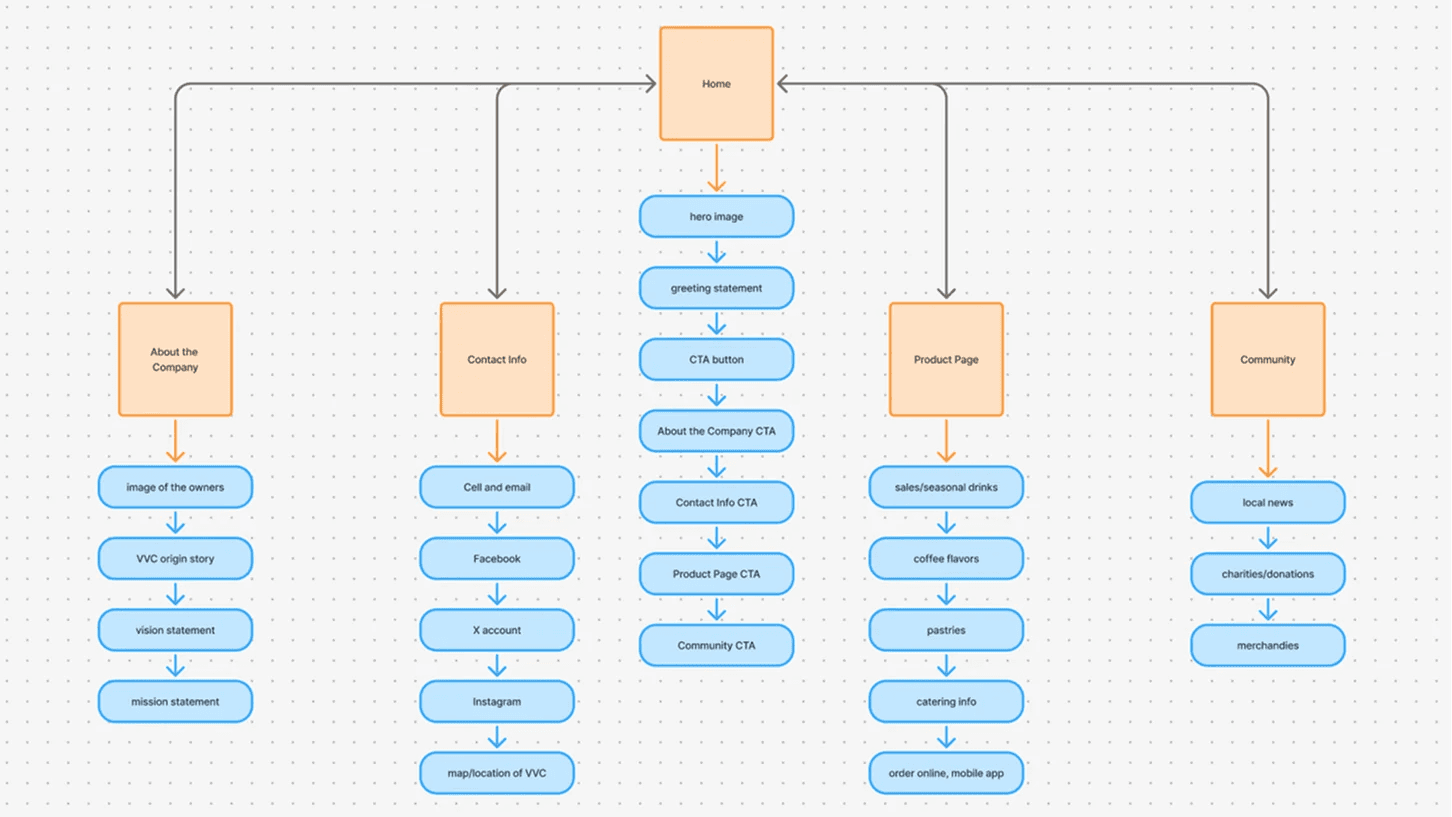
Sitemap for main Valley View Coffee pages, made with Figma's FigJam feature
KEY DESIGN DECISIONS
1
Circular Visuals
Why: Derived from the logo and Prescott landscape, reinforcing brand consistency across the site
Impact: stronger visual identity and cohesion
2
Simplified Navigation System
3
Community-focused Content
Why: Dedicated space for events and outreach, highlighting brand values beyond products
Impact: stronger emotional connection with users
Design
Warm, grounded, and intentionally simple.
The design reflects Prescott’s landscape while maintaining clarity and usability.
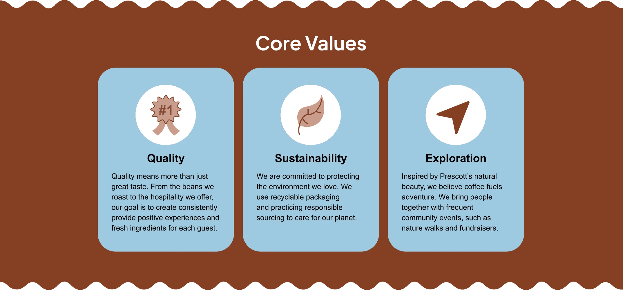
Color Palette
Rust reds, tans, and cool blues reflect the natural Prescott environment and create warmth and balance.

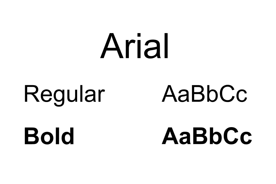
Typography
Arial typeface maintains readability and structure.
Graphics
Circular shapes and custom icons reinforce the brand story, while wavy lines in the rust-colored sections mimic the liquid state of coffee.
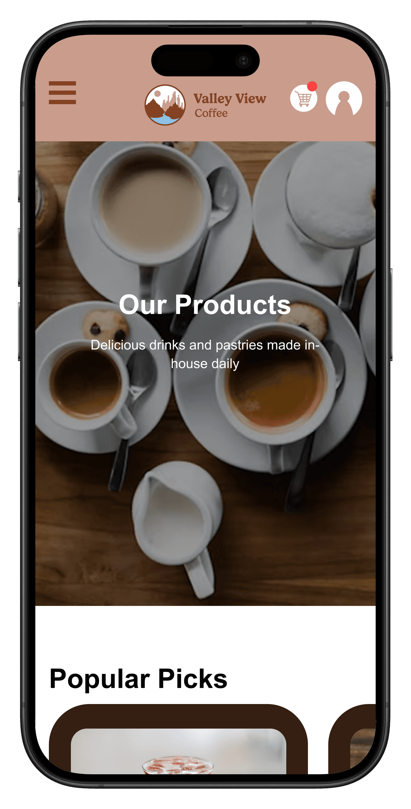
KEY SCREENS
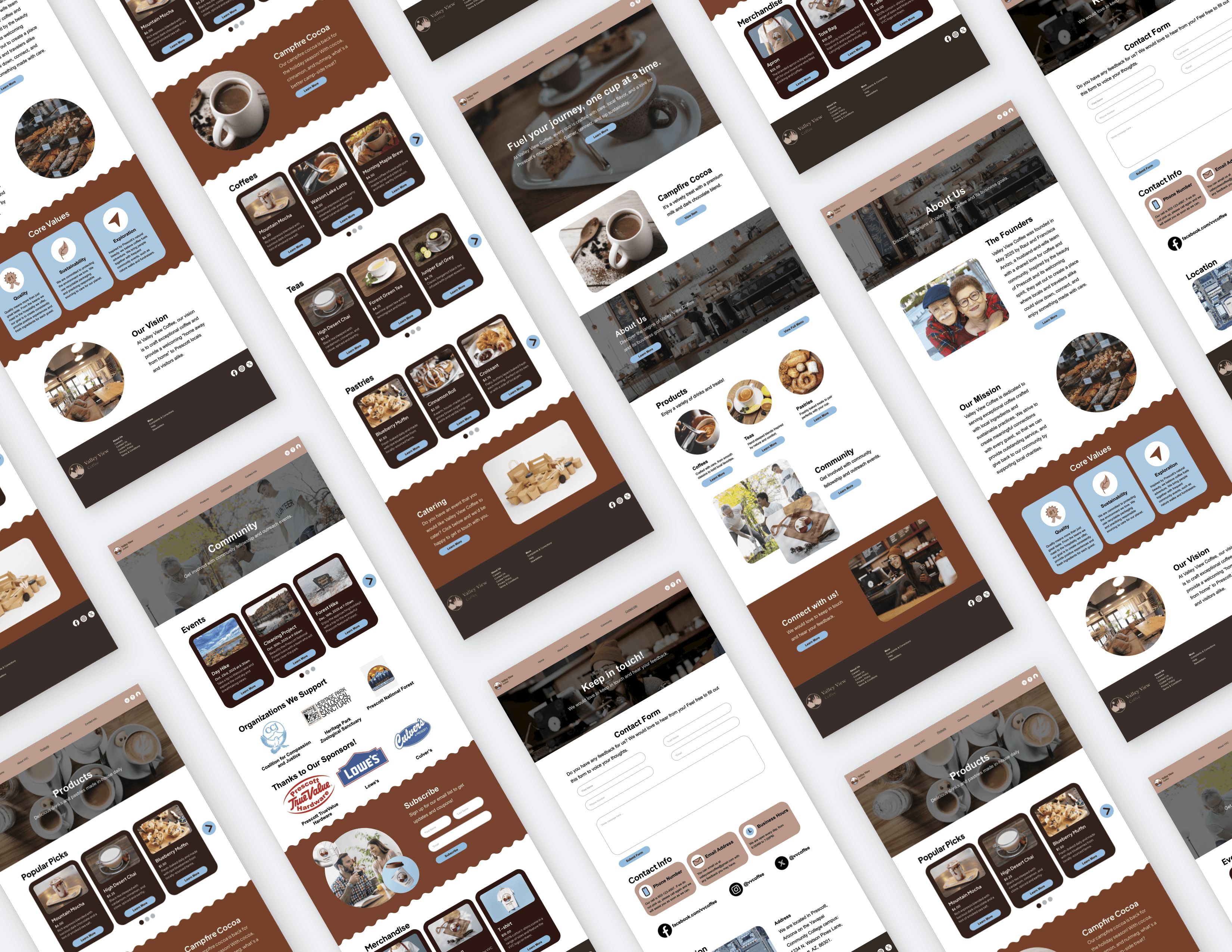
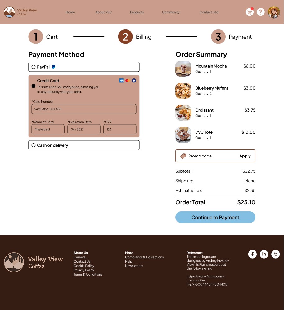
Main web pages: Home, About, Products, Contact, & Community
E-commerce pages: user flow
Micro-interactions & Delightful Additions
Smooth hover states on navigation and buttons
Subtle transitions between sections
Responsive layout shifts across devices
Reflection
Translating brand into experience requires intention at every level.
This project emphasized the importance of aligning visual identity, structure, and interaction to create a cohesive experience.
Lessons Learned
1
Both visuals and experience impact brand identity.
A cohesive experience requires translating identity into every detail of the interface.
2
Clear vision streamlines execution.
Identifying how the design should look in Figma made the Webflow building process faster and more efficient.
3
Digital spaces should reflect real experiences.
The website should feel like an extension of the physical environment, not a separate entity.
WHAT WORKED WELL
Alignment between brand and UI
The digital experience reflects the Valley View Coffee brand.
Clear, structured navigation
Users could quickly find what they needed without confusion.
Community-centered storytelling
Highlighting events and values added depth beyond products.
WHAT I'D DO DIFFERENTLY
Conduct user testing with real customers
Gathering feedback from actual coffee shop visitors would strengthen real-world relevance.
Expand e-commerce functionality
Building out the full shopping experience would complete the system.
Enhance the existing brand
Adding more visual elements, like a topographic map pattern, to increase delight and brand identity.
Areas to Explore
If I had more time and resources, I would:
Full e-commerce integration
Seamless online ordering and product purchasing
Loyalty and rewards system
Encouraging repeat visits and engagement with gamification
Event-based interactions
More dynamic ways to showcase community involvement, such as promotional videos
Let's work together!
Interested in collaborating or learning more about my process? I'd love to hear from you.