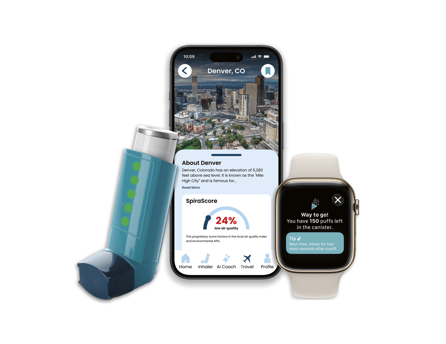
Spira Smart Inhaler & Mobile App
Designed an application compatible with mobile devices and smartwatches that syncs with a Bluetooth Smart Inhaler.
SKILLS USED

ROLE
UX/UI Designer
TIMELINE
4 weeks (Nov. 2025 - Dec. 2025)
TEAM
Solo project
OVERVIEW
SOFTWARE


The Challenge
THE PROBLEM
Asthma management relies heavily on inhalers—but most users lack clear, real-time guidance. Small uncertainties can lead to misuse, anxiety, and preventable health risks.
• Over 80% of users use their inhalers incorrectly
• Over 50% are unsure when their inhaler is empty
• Environmental triggers (pollen, air quality, altitude) are unpredictable
• Support is not always available in high-stress moments
Project Goals
Primary Goal
Create a simple system that builds confidence in daily use
Business Goal
Enter a growing $10B+ market with a differentiated product
User Goal
Feel informed, prepared, and in control

Constraints and Consderations
Timeline: 4 weeks, 2 sprints
Security: Health + location data requires privacy awareness
Technical: BLE connectivity + low-power hardware limitations
Research
Understanding behavior before designing solutions.
I explored how users interact with inhalers and where confusion or breakdowns occur.
RESEARCH METHODOLOGIES
Secondary Research - Medical Studies & Industry Reports
Why this method:
To identify trends and gaps in existing research
Participants:
N/A
Key Findings:
Incorrect inhaler use is extremely common
Users rely on guesswork for dose awareness
Market is rapidly growing ($10.1B → $18.4B by 2034)
KEY INSIGHTS
Confidence comes from clarity in the moment
Users need reassurance while using the inhaler—not after.
“I just want to know I’m doing it right.”
Tracking must be automatic to be reliable
Manual input creates friction and gets abandoned.
“I wouldn’t log it every time.”
Environment plays a bigger role than users realize
Triggers outside the user’s control create uncertainty.
“Sometimes it just gets worse, and I don’t know why.”
"I don't know if I'm using it right, but I hope I am."
COMPETITOR ANALYSIS
Most solutions solve one problem—not the full experience.
I analyzed both direct competitors to identify market gaps and opportunities for differentiation.
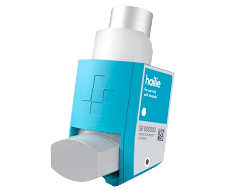
Competitor #1 - Adherium Hailie™
Pros
• tracks puff count
Cons
• no emergency alerts
• limited real-time guidance
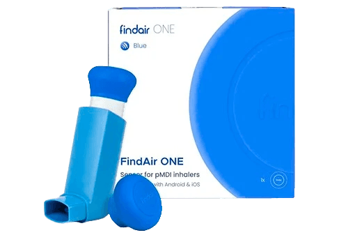
Competitor #2 - FindAir One Add-on™
Pros
• provides environmental data
Cons
• no emergency alerts
• no AI coaching
Differentiation Opportunities
Ideation
Designing a system, not just a device.
I explored how physical and digital touchpoints could work together to reduce uncertainty.
1
3
4
This slide is from a pitch deck I used to describe the "new tech" aspect behind the project.
KEY DESIGN DECISIONS
1
Reusable Sleeve System
Why: It slides over existing MDI inhalers, reducing waste and increasing accessibility.
Impact: More practical, scalable solution
2
5-LED Dose Indicator
3
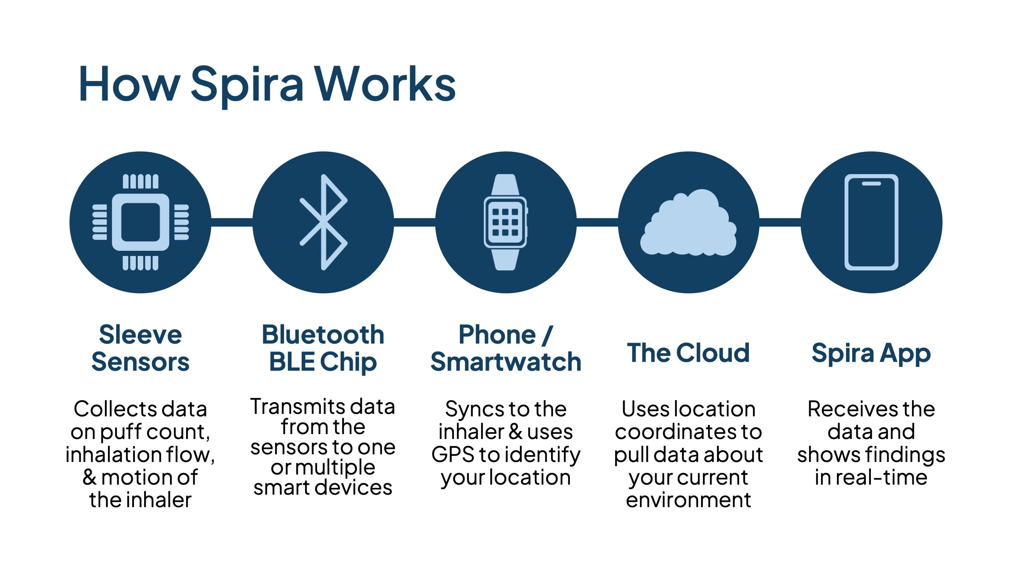
Real-Time Data Collection
Why: It combines sensor data and environmental APIs, while translating complex inputs into simple, relevant insights.
Impact: More informed, proactive decisions
Design
Calm, clear, and intentionally minimal.
The design prioritizes clarity in both high-stress and everyday moments.
Color Palette
Cool blues and soft neutrals create a sense of calm and trust. Red is used sparingly for alerts and emergency protocols.

Typography
Graphics
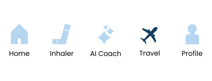
Minimal icons guide users without adding noise.
KEY SCREENS
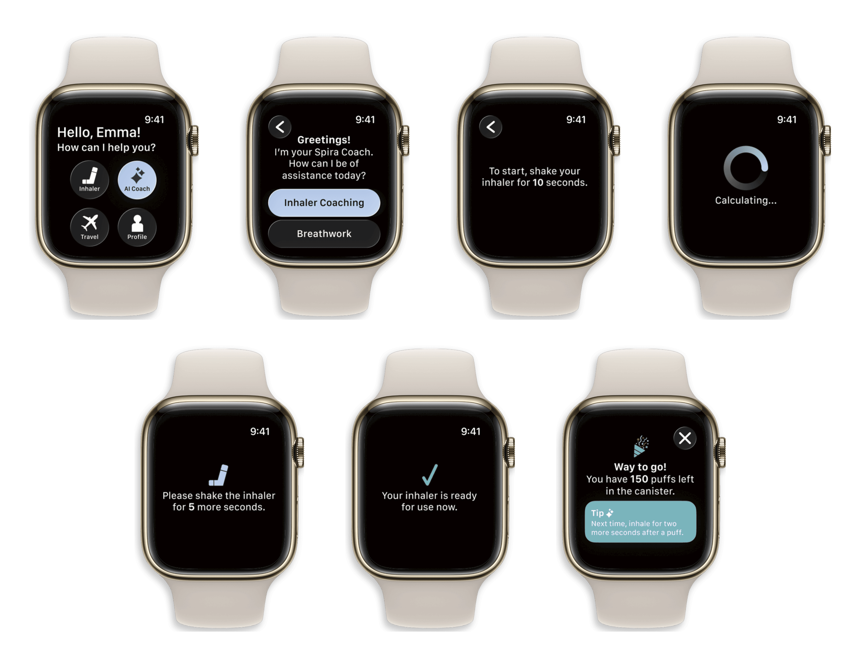
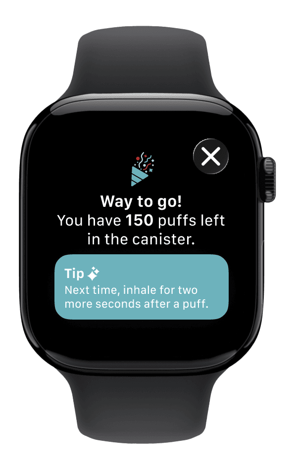
Smartwatch screens for the AI coaching user flow
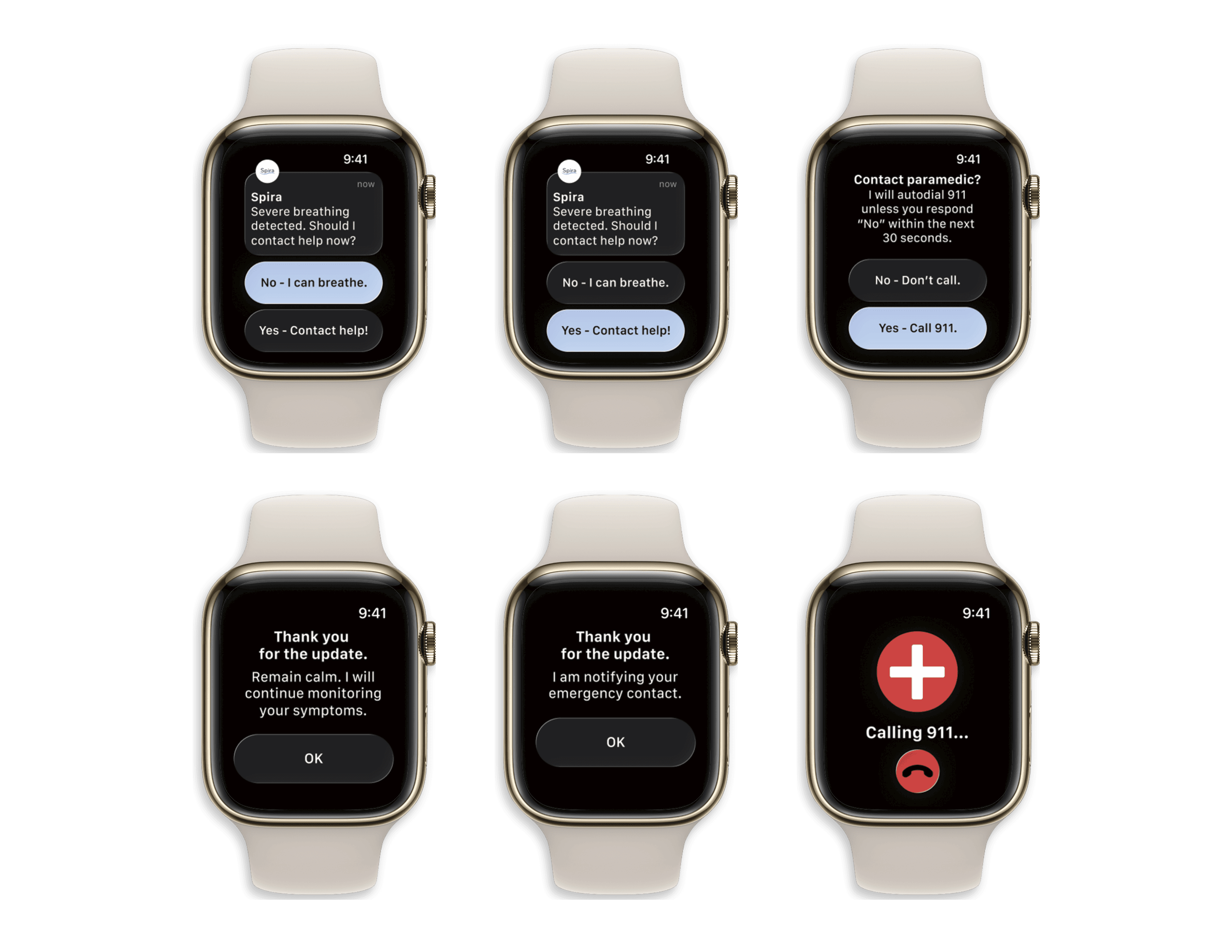
Smartwatch screens for the emergency protocol user flow
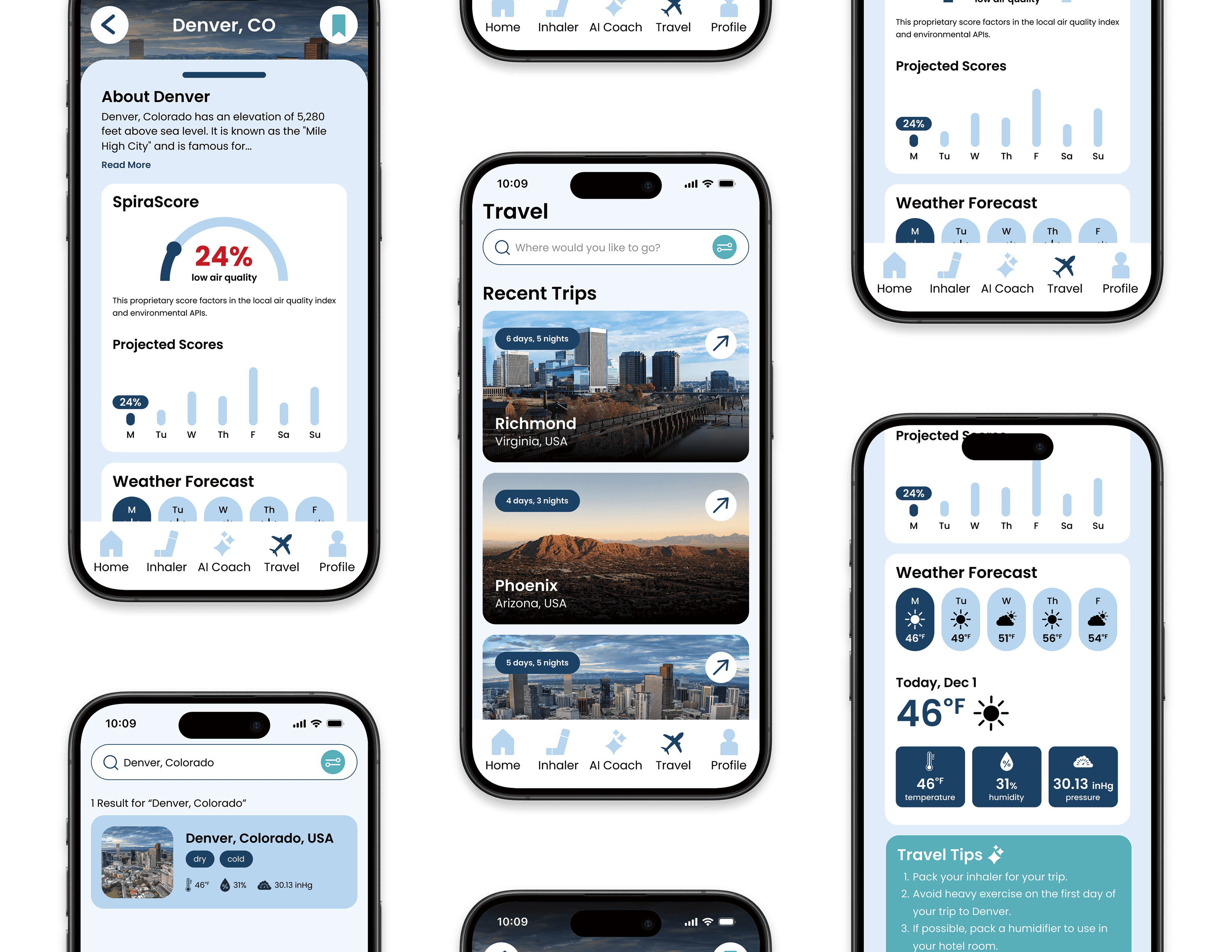
Mobile app screens for the traveling user flow
Micro-interactions & Delightful Additions
LED lights: subtly updates with each puff
Emergency alert prompts: for gentle check-ins
Confirmation screens: for immediate feedback
Reflection
Designing for real life, not ideal conditions.
This project reinforced the importance of designing for real-life moments with clarity, care, and intention.
Lessons Learned
1
Design with the user's life scenarios in mind.
Real value comes from supporting users in high-pressure, real-world situations where decisions need to be quick and intuitive.
2
Clarity reduces anxiety.
By keeping information simple to understand and clearly visible, users can feel more confident and in control of their experiences.
3
Less is more.
Constraints lead to better design. Limiting features and focusing on what matters to the user resulted in a more practical, thoughtful solution.
WHAT WORKED WELL
Designing across physical and digital touchpoints
Creating a connected system (sleeve, app, watch) made the experience more holistic and useful in real moments.
Prioritizing clarity over feature volume
Focusing on only what users truly need led to a simpler, more intuitive experience.
Grounding decisions in real user uncertainty
Designing around moments of confusion and stress made the solution feel relevant and supportive.
WHAT I'D DO DIFFERENTLY
Conduct primary research with asthma patients
would prioritize direct interviews with people who have asthma to ground the solution more deeply in lived experience.
Explore expansion across inhaler types
I would investigate how the sleeve system could adapt to different inhaler formats to increase accessibility and scalability.
Test an AI chatbot interaction model
I would explore a more conversational interface to make coaching feel more natural and supportive over time.
Areas to Explore
If I had more time and resources, I would explore:
Advanced AI Coaching
more personalized, instantaneous guidance
Wearable Expansion
Enhanced smartwatch integration; devices for children
Predictive alerts
Anticipating risks before symptoms escalate
"Spira — Confidence in every breath."
Let's work together!
Interested in collaborating or learning more about my process? I'd love to hear from you.